Showing parts-of-a-whole using Pie Charts and Stacked Bar Charts
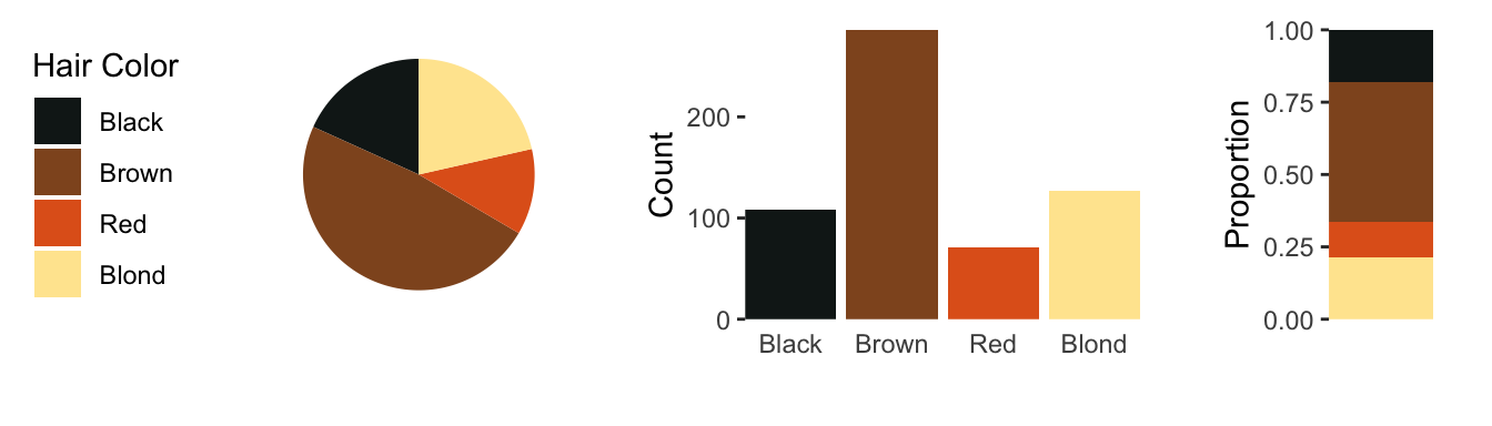
We are often interested in understanding parts-of-a-whole, that is, the proportions of each group in a categorical variable. Molecular biologists will be familiar with a common part-of-a-whole question concerning gene classifications. In a list of significantly over-expressed genes identified by a large screen, like a microarray or a mass spectrometry, we can ask the question which gene families are more abundant than expected? which are less abundant? Consider the single variable, hair color in \(n = 592\) individuals.
Hair
N
Black
108
Brown
286
Red
71
Blond
127
A common way to view this data would be a pie chart, which at this point is not to bad. There is only one variable, hair color, and there are only four groups to consider.
Figure 1: a pie chart and a stacked bar chart of the hair color of 592 individuals.
In this case a stacked bar chart, although easier to read, it not that much more informative than the pie chart. This changes quickly once we start adding variables, like eye color and sex. If we continue along these lines we’ll end up with a collection of pie charts and bar charts which fail to serve the purpose of
Males
Hair
Eye
N
Black
Brown
32
Brown
Brown
53
Red
Brown
10
Blond
Brown
3
Black
Blue
11
Brown
Blue
50
Red
Blue
10
Blond
Blue
30
Black
Hazel
10
Brown
Hazel
25
Red
Hazel
7
Blond
Hazel
5
Black
Green
3
Brown
Green
15
Red
Green
7
Blond
Green
8
Females
Hair
Eye
N
Black
Brown
36
Brown
Brown
66
Red
Brown
16
Blond
Brown
4
Black
Blue
9
Brown
Blue
34
Red
Blue
7
Blond
Blue
64
Black
Hazel
5
Brown
Hazel
29
Red
Hazel
7
Blond
Hazel
5
Black
Green
2
Brown
Green
14
Red
Green
7
Blond
Green
8
Beginning with
So the real question we are interested in is not just the proportions within a categorical variable, but which groups are over or under-represented. This qould require that we have some a priori
intersection between , but The implicit question is if any sub-groups are over- or under-represented.
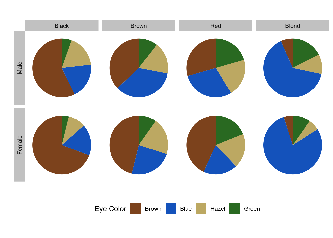
As an example, we will consider the results for a survey of male and female hair and eye colour. We want to uncover and represent any biases in the data set which may reveal previously unappreciated associations between the three variables: sex, hair colour and eye colour.
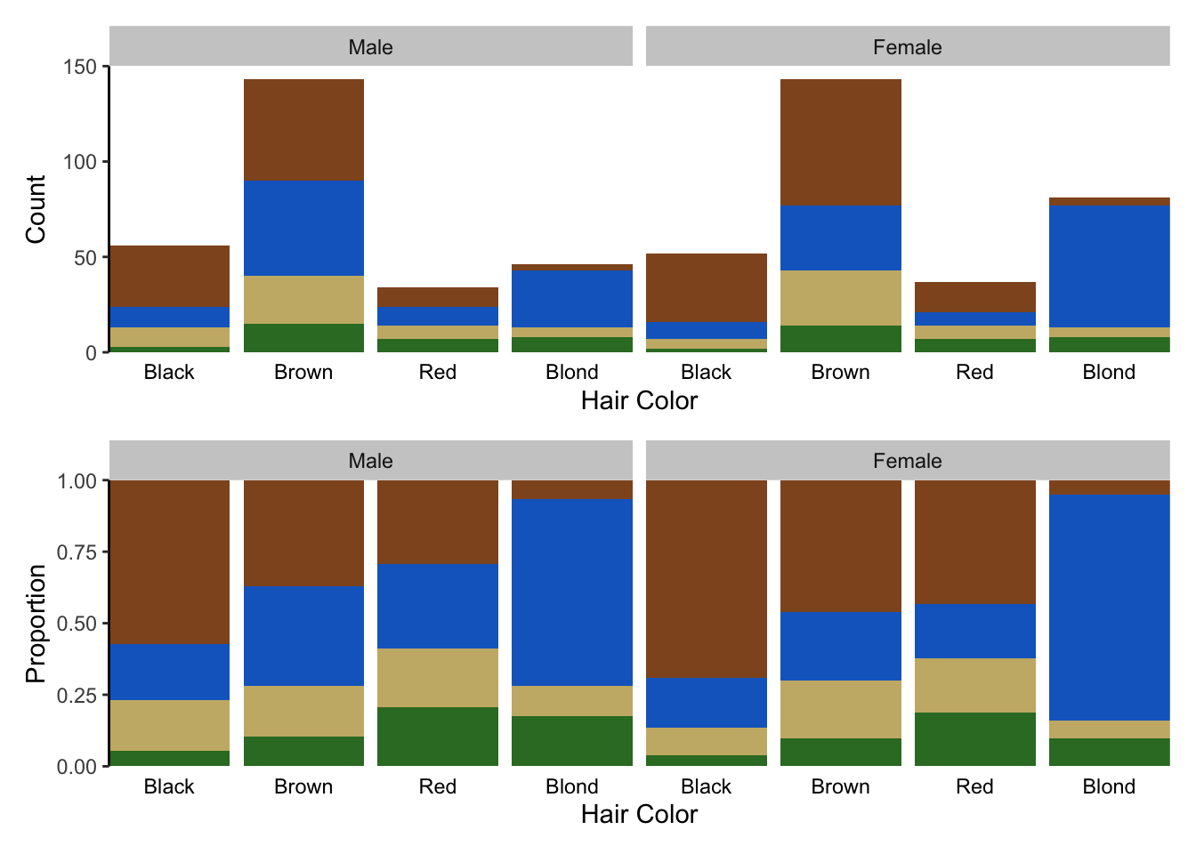
As we have seen, bar charts are usually the first choice for nominal comparisons (fig. @ref(fig:bar-counts)). However, the major deficiency here is that we are presenting the absolute values, when we are really interested in the parts-of-a-whole distribution. Bar charts don’t reveal any interesting trends, such as over- or under-representation without a large time investment from the reader.
As an alternative to the bar chart, pie charts and stacked bar charts are commonly used for representing parts-of-a-whole. Unfortunately, they both have major drawbacks in visual perception and don’t excel at communicating an effective story. Here we will show how this data is presented and provide a solution using mosaic plots in the next sub-section.
Use pie charts and stacked bar charts with caution
1 Your readers will preferentially and intuitively compare different aspects of a pie chart. Regardless of their particular preference, imagine the difficulty in calculating the angle (\(\theta\)), the area (\(\theta r^{2}/2\)), or the arc length (\(r(\theta\pi/180)\)), which which is what you are effectively asking your readers to do in their minds.
Pie charts are particularly appealing for representing parts-of-a-whole data sets since they intuitively tell the reader that all parts add up to 100%. In addition, the sample size can be encoded in the radius of the circle (fig. Figure fig-bar-and-pie). The major disadvantage of pie charts is that they encode values using slice area, arc length or angle at center, all of which are fairly inaccurate methods of encoding quantitative information (see Figure fig-cont-encoding).
Perhaps the only instance where pie charts are suitable is for representing large quantitative differences in a small number of groups, which begs the question if a visualization is even necessary.
Figure 2: dissecting
Figure 3: Multiple pie charts, stacked bar plots and a filled bar chart copared. Each set contains information on 32 unique combinations of hair, eye and sex. The multiple pie charts have become unweildly. Both bar chart variants are acceptable, each containing diffrent information.
Stacked bar charts, plotted on a relative scale, depict the relative proportions of each sub-group in a categorical variable (Figure fig-stacked-bar-plots). This provides a common scale of relative abundances. Similar to the radius of pie charts, we can encode the sample size in the width of each bar.
Stacked bar charts are an improvement over the pie charts since at least some of the sub-groups are plotted on a common scale. However, since we have four categories, only the two at the bottom and top of the bar chart benefit from this feature. In Figure fig-stacked-bar-plots we have plotted the three variables as three pair-wise plots. Although all our data is visualized, these plots fail to really tell a story, we still don’t know which sub-groups are over- or under-represented and the relationship between hair and eye color is not displayed, a third plot would be required for that.
Barnett, Adrian, and Nicole White. 2024. “Something is off-base with this title: P esteems, statical significance and more slapdash stats.”Significance 21 (1): 11–13. https://doi.org/10.1093/jrssig/qmae007.
Bjork, Robert A, and Elizabeth L Bjork. 2011. “Making Things Hard on Yourself, but in a Good Way: Creating Desirable Difficulties to Enhance Learning.” In Psychology and the Real World: Essays Illustrating Fundamental Contributions to Society, edited by Morton A Gernsbacher, Robert W Pew, Leah M Hough, and James R Pomerantz, 56–64. Worth Publishers.
Briscoe, M. H. 2012. Preparing Scientific Illustrations: A Guide to Better Posters, Presentations, and Publications. Springer New York. https://books.google.de/books?id=mYTlBwAAQBAJ.
Cepeda, Nicholas J, Harold Pashler, Edward Vul, John T Wixted, and Doug Rohrer. 2006. “Distributed Practice in Verbal Recall Tasks: A Review and Quantitative Synthesis.”Psychological Bulletin 132 (3): 354–80.
Chasson, Gregory, and Sara R. Jarosiewicz. 2014. “Social Competence Impairments in Autism Spectrum Disorders.” In Comprehensive Guide to Autism, edited by Vinood B. Patel, Victor R. Preedy, and Colin R. Martin, 1099–1118. New York, NY: Springer New York. https://doi.org/10.1007/978-1-4614-4788-7_60.
Cheeseman, Ian H., Natalia Gomez-Escobar, Celine K. Carret, Alasdair Ivens, Lindsay B. Stewart, Kevin KA Tetteh, and David J. Conway. 2009. “Gene Copy Number Variation Throughout the Plasmodium Falciparum Genome.”BMC Genomics 10 (1): 353. https://doi.org/10.1186/1471-2164-10-353.
Daston, L., and P. Galison. 2007. Objectivity. Book Collections on Project MUSE. Zone Books.
Diemand-Yauman, Connor, Daniel M Oppenheimer, and Erikka B Vaughan. 2011. “Fortune Favors the Bold (and the Italicized): Effects of Disfluency on Educational Outcomes.”Cognition.
Hench, Virginia K., and Lishan Su. 2011. “Regulation of IL-2 Gene Expression by Siva and FOXP3 in Human t Cells.”BMC Immunology 12 (1): 54. https://doi.org/10.1186/1471-2172-12-54.
Hill, Jennifer, and Maria Singer. 2014. “A Comparison of Print and Digital Reading Comprehension by Middle School Students.”Reading Research Quarterly 49 (2): 185–203. https://doi.org/10.1002/rrq.68.
Lupton, E. 2010. Thinking with Type, 2nd Revised and Expanded Edition: A Critical Guide for Designers, Writers, Editors, & Students. Princeton Architectural Press. https://books.google.de/books?id=Y_NVRQAACAAJ.
Mangen, Anne, and Don Kuiken. 2014. “Lost in an iPad: Narrative Engagement on Paper and Tablet.”Scientific Study of Literature 4 (2): 150–77. https://doi.org/10.1075/ssol.4.2.01man.
Mangen, Anne, Bente R Walgermo, and Kolbjørn Brønnick. 2013. “Reading Linear Texts on Paper Versus Computer Screen: Effects on Reading Comprehension.”International Journal of Educational Research 58: 61–68. https://doi.org/10.1016/j.ijer.2012.12.002.
Margolin, Sara J, Christine Driscoll, Michael J Toland, and Jessica L Kegler. 2013. “E-Readers, Computer Screens, or Paper: Does Reading Comprehension Change Across Media Platforms?”Applied Cognitive Psychology 27 (4): 512–19. https://doi.org/10.1002/acp.2930.
Murayama, Hiroshi, Yusuke Takagi, Hirokazu Tsuda, and Yuri Kato. 2023. “Applying Nudge to Public Health Policy: Practical Examples and Tips for Designing Nudge Interventions.”International Journal of Environmental Research and Public Health. MDPI. https://doi.org/10.3390/ijerph20053962.
producer, Stephen Lambert ;. written executive, and produced by Adam Curtis ;. RDF Television; BBC. [2009?]. “The Century of the Self.” Standard format. Wyandotte, MI : BigD Productions, [2009?]. https://search.library.wisc.edu/catalog/9910135083802121.
Roediger, Henry L, and Jeffrey D Karpicke. 2006. “Test-Enhanced Learning: Taking Memory Tests Improves Long-Term Retention.”Psychological Science 17 (3): 249–55.
Rohrer, Doug, and Kelli Taylor. 2007. “The Shuffling of Mathematics Problems Improves Learning.”Instructional Science 35 (6): 481–98.
Roßa, N. 2017. Sketchnotes: Visuelle Notizen für Alles. frechverlag.
———. 2020. Sketchnotes: Die Große Symbol-Bibliothek. frechverlag.
Rousselet, Guillaume A, John J Foxe, and J Paul Bolam. 2016. “A Few Simple Steps to Improve the Description of Group Results in Neuroscience.”Eur. J. Neurosci. 44 (9): 2647–51.
Sanges, Remo, Yavor Hadzhiev, Marion Gueroult-Bellone, Agnes Roure, Marco Ferg, Nicola Meola, Gabriele Amore, et al. 2013. “Highly conserved elements discovered in vertebrates are present in non-syntenic loci of tunicates, act as enhancers and can be transcribed during development.”Nucleic Acids Research 41 (6): 3600–3618. https://doi.org/10.1093/nar/gkt030.
Singer, Leona M, Patricia A Alexander, and Deborah D Reese. 2014. “Reading on Paper and Digitally: What the Past Decades of Empirical Research Reveal.”Review of Educational Research 84 (4): 509–45. https://doi.org/10.3102/0034654314541101.
Slamecka, Norman J, and Peter Graf. 1978. “The Generation Effect: Delineation of a Phenomenon.”Journal of Experimental Psychology: Human Learning and Memory 4 (6): 592–604.
“Status of Mind - social media and young people’s mental health and wellbeing.” 2017. Royal Society for Public Health.
Wästlund, Erik, Lars Nilsson, and Kenneth Holmqvist. 2012. “Eye Movement Patterns and Reading Processes in Eye-Friendly and Non-Eye-Friendly Typography.”Information Design Journal 19 (2): 119–32.