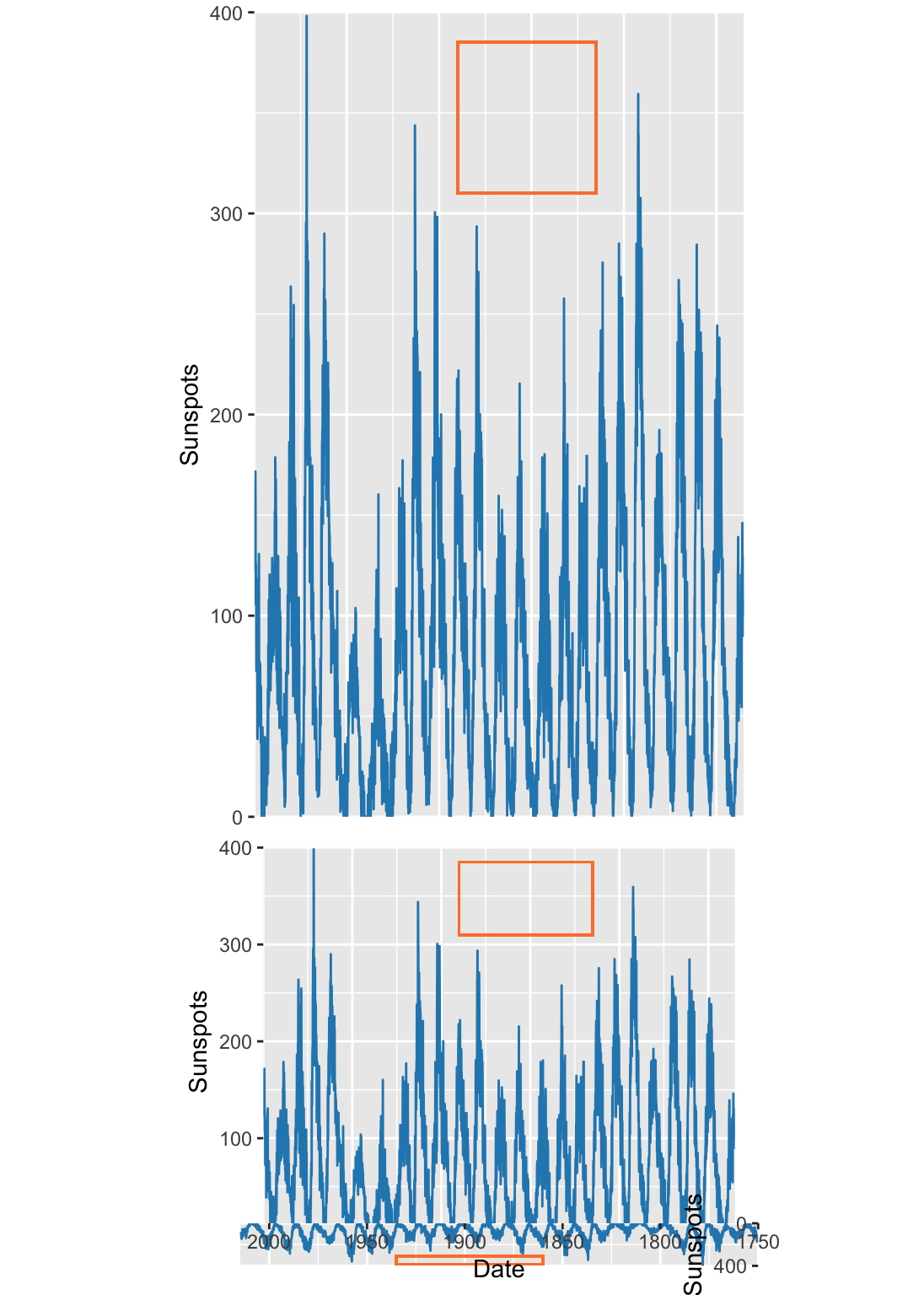
A plot’s proportions can have a large effect on how data is perceived. Therefore, finding the optimal aspect ratio (height divided by weight) is of particular interest. ?fig-aspectRatio is a classic example from William S. Cleveland. Here we have empirical data going back to 1750 — the number of sun spots which appear on the surface of the sun. There are three clear trends in this data. In the upper plot, we can see two trends.
First, sun spots appear and disappear in a period of approximately 11-years. The beginning and end of these periods has been recorded and we’ll get to the individual trends shortly. Second, there are global rises and dips in the peaks and troughs.
The upper plot has an aspect ratio of 1:1, meaning that one unit on the y axis takes up the same physical space as one unit on the x axis. this is highlighted by the red, perfectly square, box. In this case, there’s no reason for a 1:1 aspect ratio. The axes are on completely different scales — the number of sun spots and the date.
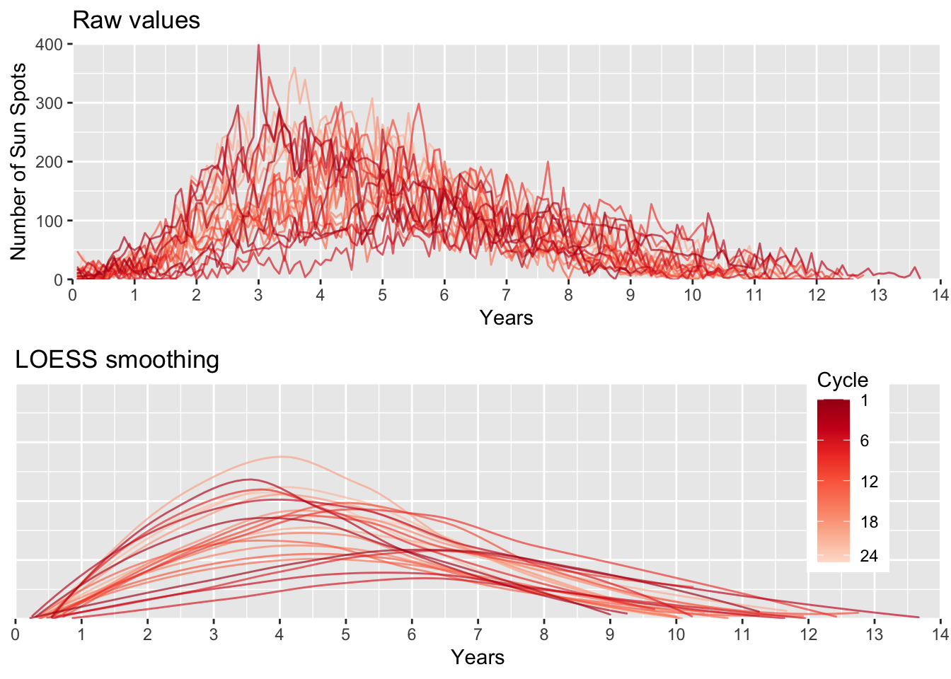
Although the relationship between intensity and symmetry in sun spot oscillations is a well-observed phenomena, it is admittedly still somewhat difficult to see in low aspect ratio plot of fig. ?fig-aspectRatio. Now that we have a clear message we want to communicate, let’s see if we can make a plot that emphasizes that point.
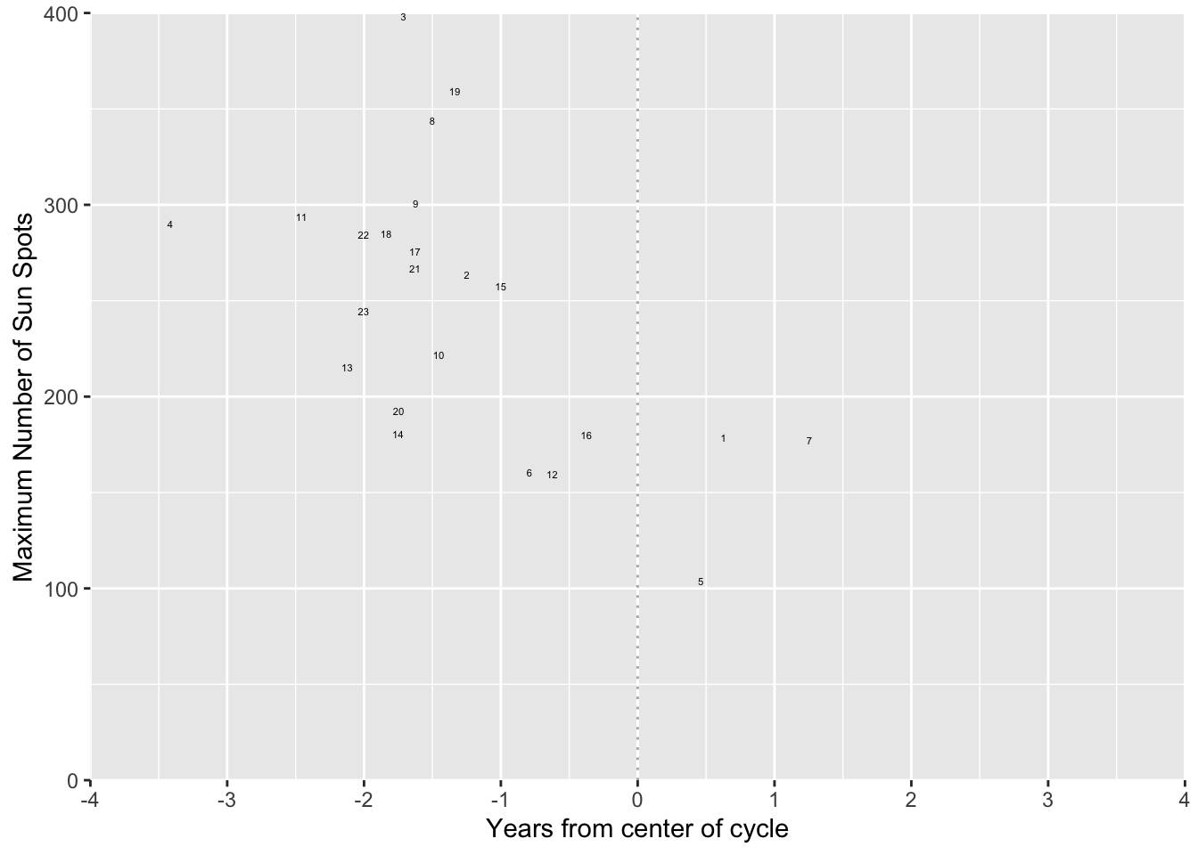
We can reduce the complexity even further by plotting only wlhat we’re interested in. Here, for each cycle, we can plot the maximum number of sun spots and distance from the middle of the cycle. As we expected, the higher the maximum number is, the earlier the peak occurs.
Although Cleveland tried to implement an analytical solution to choosing the optimal aspect ratio, it was not applicable in all cases and was never widely adopted. This means you’re at your own discretion to choosing an aspect ratio.
Barnett, Adrian, and Nicole White. 2024.
“Something is off-base with this title: P esteems, statical significance and more slapdash stats.” Significance 21 (1): 11–13.
https://doi.org/10.1093/jrssig/qmae007.
Berger, J. 2008.
Ways of Seeing. Penguin Modern Classics. Penguin Books Limited.
https://books.google.de/books?id=QxdperNq5R8C.
Berne, E. 2011.
Games People Play: The Basic Handbook of Transactional Analysis. Tantor Media, Incorporated.
https://books.google.de/books?id=D9dOBAAAQBAJ.
Bilz, S., R. Klanten, and M. Mischler. 2011.
The Little Know-It-All: Common Sense for Designers. Gestalten.
https://books.google.de/books?id=JA8FfAEACAAJ.
Bjork, Robert A, and Elizabeth L Bjork. 2011. “Making Things Hard on Yourself, but in a Good Way: Creating Desirable Difficulties to Enhance Learning.” In Psychology and the Real World: Essays Illustrating Fundamental Contributions to Society, edited by Morton A Gernsbacher, Robert W Pew, Leah M Hough, and James R Pomerantz, 56–64. Worth Publishers.
Bloom, P. 2016.
Against Empathy: The Case for Rational Compassion. HarperCollins.
https://books.google.de/books?id=op67CwAAQBAJ.
Bringhurst, R. 2004.
The Elements of Typographic Style. Elements of Typographic Style. Hartley & Marks, Publishers.
https://books.google.de/books?id=940sAAAAYAAJ.
Briscoe, M. H. 2012.
Preparing Scientific Illustrations: A Guide to Better Posters, Presentations, and Publications. Springer New York.
https://books.google.de/books?id=mYTlBwAAQBAJ.
Cepeda, Nicholas J, Harold Pashler, Edward Vul, John T Wixted, and Doug Rohrer. 2006. “Distributed Practice in Verbal Recall Tasks: A Review and Quantitative Synthesis.” Psychological Bulletin 132 (3): 354–80.
Chasson, Gregory, and Sara R. Jarosiewicz. 2014.
“Social Competence Impairments in Autism Spectrum Disorders.” In
Comprehensive Guide to Autism, edited by Vinood B. Patel, Victor R. Preedy, and Colin R. Martin, 1099–1118. New York, NY: Springer New York.
https://doi.org/10.1007/978-1-4614-4788-7_60.
Cheeseman, Ian H., Natalia Gomez-Escobar, Celine K. Carret, Alasdair Ivens, Lindsay B. Stewart, Kevin KA Tetteh, and David J. Conway. 2009.
“Gene Copy Number Variation Throughout the Plasmodium Falciparum Genome.” BMC Genomics 10 (1): 353.
https://doi.org/10.1186/1471-2164-10-353.
Cherry, C. 1980.
On Human Communication: A Review, a Survey, and a Criticism. MIT Press Classics. MIT Press.
https://books.google.de/books?id=kQwqSwAACAAJ.
Daston, L., and P. Galison. 2007. Objectivity. Book Collections on Project MUSE. Zone Books.
Diemand-Yauman, Connor, Daniel M Oppenheimer, and Erikka B Vaughan. 2011. “Fortune Favors the Bold (and the Italicized): Effects of Disfluency on Educational Outcomes.” Cognition.
Hamming, R., and B. Victor. 2020. The Art of Doing Science and Engineering: Learning to Learn. Stripe Matter Incorporated.
Hench, Virginia K., and Lishan Su. 2011.
“Regulation of IL-2 Gene Expression by Siva and FOXP3 in Human t Cells.” BMC Immunology 12 (1): 54.
https://doi.org/10.1186/1471-2172-12-54.
Hill, Jennifer, and Maria Singer. 2014.
“A Comparison of Print and Digital Reading Comprehension by Middle School Students.” Reading Research Quarterly 49 (2): 185–203.
https://doi.org/10.1002/rrq.68.
Hofmann, A. H. 2020.
Scientific Writing and Communication: Papers, Proposals, and Presentations. Oxford University Press.
https://books.google.de/books?id=vQXuxAEACAAJ.
Jeffares, A. N., and M. B. Davies. 1958.
The Scientific Background: A Prose Anthology. Pitman.
https://books.google.de/books?id=F_gLAQAAIAAJ.
Kahneman, D. 2011.
Thinking, Fast and Slow. Farrar, Straus; Giroux.
https://books.google.com.ec/books?id=ZuKTvERuPG8C.
Lupton, E. 2010.
Thinking with Type, 2nd Revised and Expanded Edition: A Critical Guide for Designers, Writers, Editors, & Students. Princeton Architectural Press.
https://books.google.de/books?id=Y_NVRQAACAAJ.
Mangen, Anne, and Don Kuiken. 2014.
“Lost in an iPad: Narrative Engagement on Paper and Tablet.” Scientific Study of Literature 4 (2): 150–77.
https://doi.org/10.1075/ssol.4.2.01man.
Mangen, Anne, Bente R Walgermo, and Kolbjørn Brønnick. 2013.
“Reading Linear Texts on Paper Versus Computer Screen: Effects on Reading Comprehension.” International Journal of Educational Research 58: 61–68.
https://doi.org/10.1016/j.ijer.2012.12.002.
Margolin, Sara J, Christine Driscoll, Michael J Toland, and Jessica L Kegler. 2013.
“E-Readers, Computer Screens, or Paper: Does Reading Comprehension Change Across Media Platforms?” Applied Cognitive Psychology 27 (4): 512–19.
https://doi.org/10.1002/acp.2930.
Murayama, Hiroshi, Yusuke Takagi, Hirokazu Tsuda, and Yuri Kato. 2023.
“Applying Nudge to Public Health Policy: Practical Examples and Tips for Designing Nudge Interventions.” International Journal of Environmental Research and Public Health. MDPI.
https://doi.org/10.3390/ijerph20053962.
producer, Stephen Lambert ;. written executive, and produced by Adam Curtis ;. RDF Television; BBC. [2009?].
“The Century of the Self.” Standard format. Wyandotte, MI : BigD Productions, [2009?].
https://search.library.wisc.edu/catalog/9910135083802121.
Roediger, Henry L, and Jeffrey D Karpicke. 2006. “Test-Enhanced Learning: Taking Memory Tests Improves Long-Term Retention.” Psychological Science 17 (3): 249–55.
Rohrer, Doug, and Kelli Taylor. 2007. “The Shuffling of Mathematics Problems Improves Learning.” Instructional Science 35 (6): 481–98.
Roman, K., and J. Raphaelson. 2010.
Writing That Works, 3rd Edition: How to Communicate Effectively in Business. HarperCollins.
https://books.google.de/books?id=3Rcv5CmGYf0C.
Roßa, N. 2017. Sketchnotes: Visuelle Notizen für Alles. frechverlag.
———. 2020. Sketchnotes: Die Große Symbol-Bibliothek. frechverlag.
Rousselet, Guillaume A, John J Foxe, and J Paul Bolam. 2016. “A Few Simple Steps to Improve the Description of Group Results in Neuroscience.” Eur. J. Neurosci. 44 (9): 2647–51.
Sanges, Remo, Yavor Hadzhiev, Marion Gueroult-Bellone, Agnes Roure, Marco Ferg, Nicola Meola, Gabriele Amore, et al. 2013.
“Highly conserved elements discovered in vertebrates are present in non-syntenic loci of tunicates, act as enhancers and can be transcribed during development.” Nucleic Acids Research 41 (6): 3600–3618.
https://doi.org/10.1093/nar/gkt030.
Shannon, Claude Elwood. 1948.
“A Mathematical Theory of Communication.” The Bell System Technical Journal 27: 379–423.
http://plan9.bell-labs.com/cm/ms/what/shannonday/shannon1948.pdf.
Singer, Leona M, Patricia A Alexander, and Deborah D Reese. 2014.
“Reading on Paper and Digitally: What the Past Decades of Empirical Research Reveal.” Review of Educational Research 84 (4): 509–45.
https://doi.org/10.3102/0034654314541101.
Slamecka, Norman J, and Peter Graf. 1978. “The Generation Effect: Delineation of a Phenomenon.” Journal of Experimental Psychology: Human Learning and Memory 4 (6): 592–604.
“Status of Mind - social media and young people’s mental health and wellbeing.” 2017. Royal Society for Public Health.
Steed, S., and an O’Reilly Media Company Safari. 2019.
Empathy at Work. O’Reilly Media.
https://books.google.de/books?id=U-j8xAEACAAJ.
Wästlund, Erik, Lars Nilsson, and Kenneth Holmqvist. 2012. “Eye Movement Patterns and Reading Processes in Eye-Friendly and Non-Eye-Friendly Typography.” Information Design Journal 19 (2): 119–32.
Weschler, L. 2006.
Everything That Rises: A Book of Convergences. McSweeney’s Books.
https://books.google.de/books?id=dqefAAAAMAAJ.
Zinsser, W. 2012.
On Writing Well, 30th Anniversary Edition: An Informal Guide to Writing Nonfiction. HarperCollins.
https://books.google.de/books?id=mp16BDRDaYQC.