In the previous chapter, we saw that jittering is useful when all points lie on a single axis, and we’ll see that again later on in this chapter. It’s clear what benefit jitter serves, so that wasn’t really controversial. In contrast, the previous example used jittering on two dimensions and gave the impresison of having more precision than we originally had. That’s perfectly acceptable, given that we are transparent about data transformations. We can make a convincing argument in favour of jittering in that it reveals more data points than we would otherwise, and all statistics are anyway calculated on the original non-transformed data.
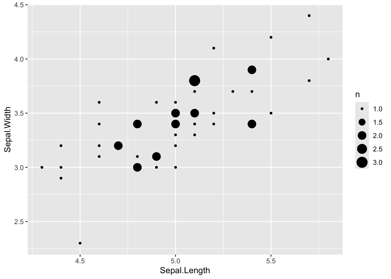
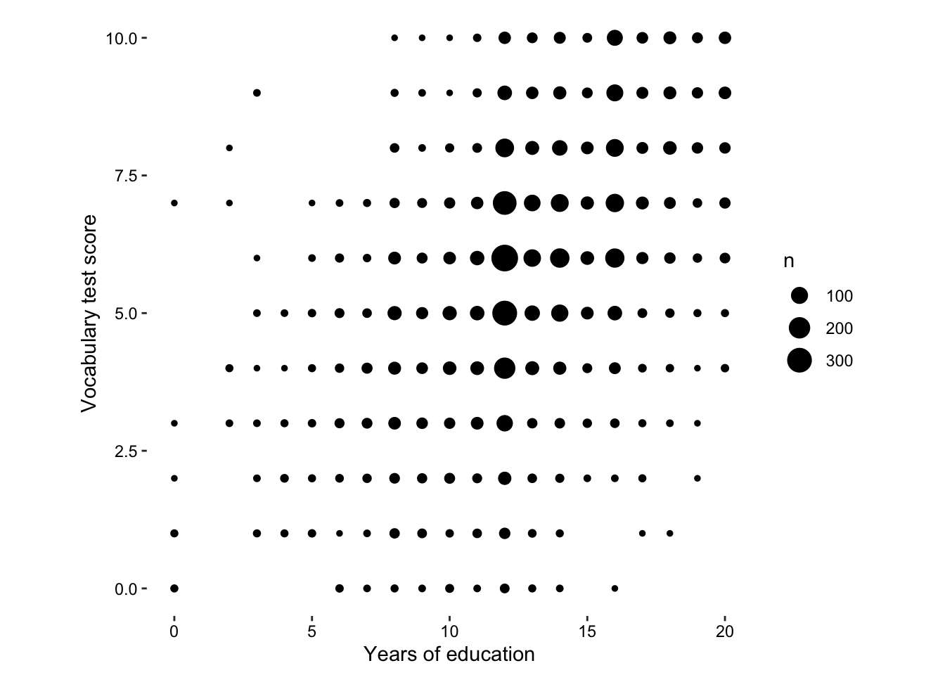
So what would be an alternative? Well, we could have set the size of the circle to the number of values.
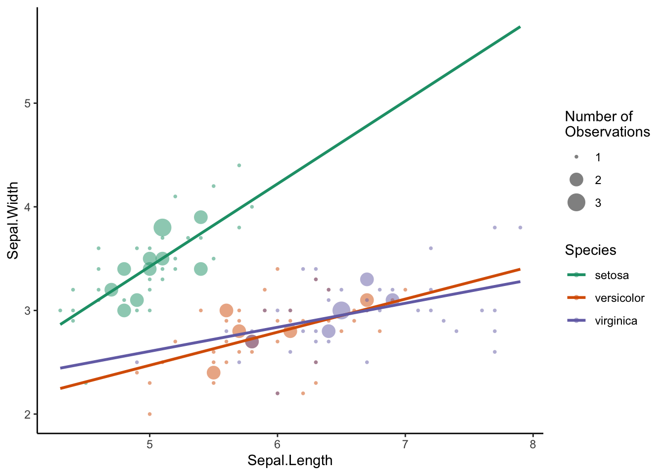
Which is actually quite nice, even if size is not the most efficient encoding element. We do encounter a problem, however, when we try to include more species. When circles of the same size overlap, the data can be obscured, and I find that the large circles draw our attention. For example, if we had to draw the linear model for virginica by hand, the slope would probably be steeper, since we may disregard the influence of the less frequent values at the edge of the distribution. Faceting may solve this problem, but that point of this visualisaiton is to compare the three models in one plot.
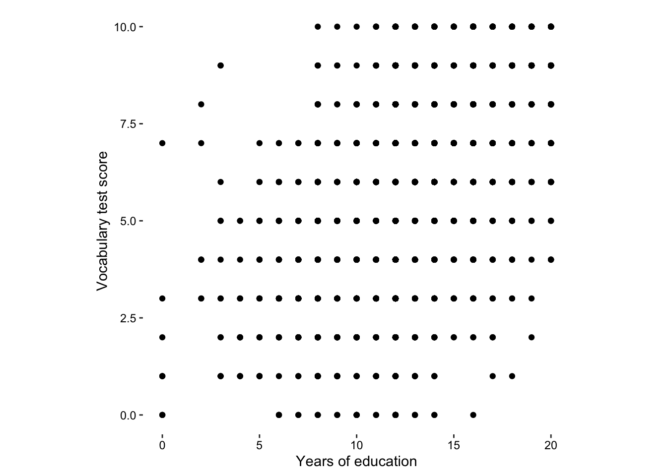
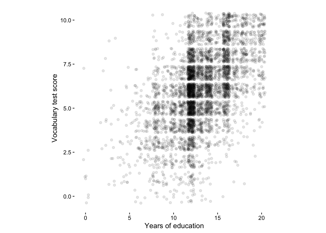
Here is a clear case for using jittering in two dimensions.
previously, we mapped the total number of observations to size, we can do the same thing here…
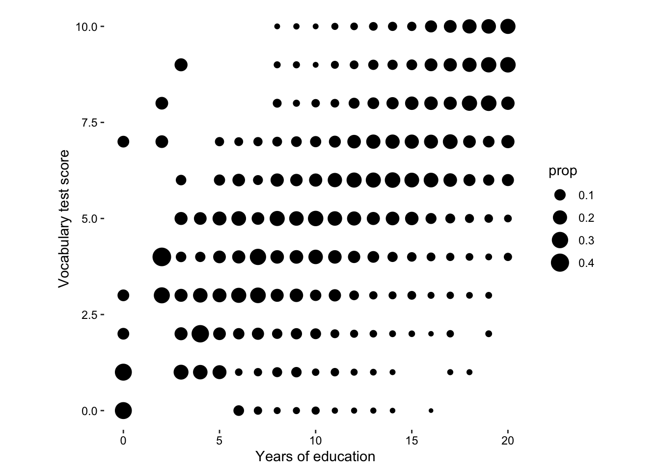
But actually, that’s not really the story of this data set, what we want to know is the relationship between vocab score and education. A more interesting statistic to map onto size would be the proportion of each vocab score per education group.
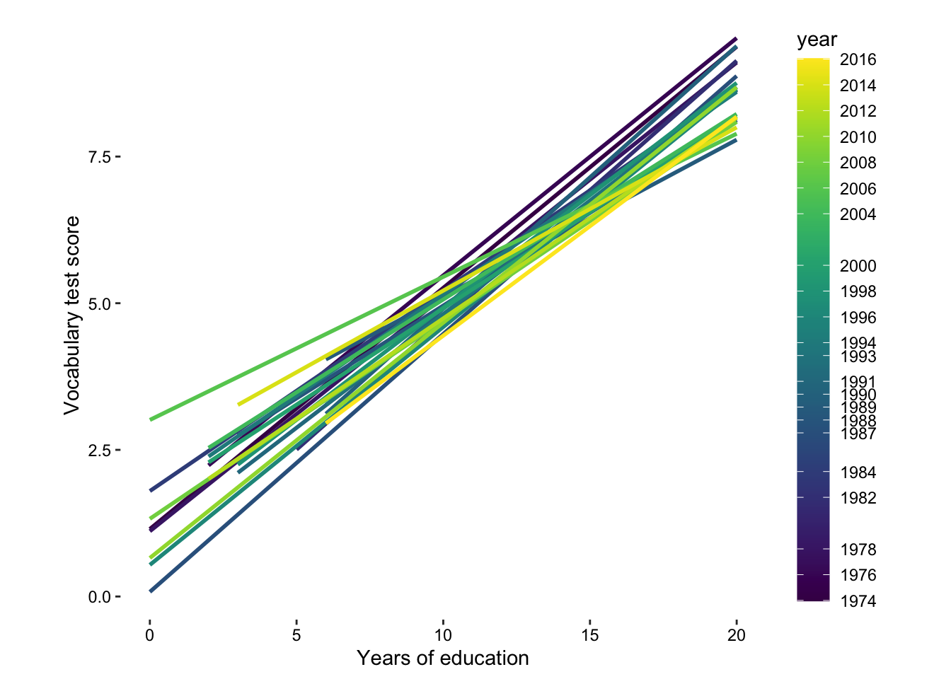
So we can see that there is a trend towards higher vocab scores given higher education scores. Let’s draw some linear models and see how that has changed over time.
Barnett, Adrian, and Nicole White. 2024.
“Something is off-base with this title: P esteems, statical significance and more slapdash stats.” Significance 21 (1): 11–13.
https://doi.org/10.1093/jrssig/qmae007.
Berger, J. 2008.
Ways of Seeing. Penguin Modern Classics. Penguin Books Limited.
https://books.google.de/books?id=QxdperNq5R8C.
Berne, E. 2011.
Games People Play: The Basic Handbook of Transactional Analysis. Tantor Media, Incorporated.
https://books.google.de/books?id=D9dOBAAAQBAJ.
Bilz, S., R. Klanten, and M. Mischler. 2011.
The Little Know-It-All: Common Sense for Designers. Gestalten.
https://books.google.de/books?id=JA8FfAEACAAJ.
Bjork, Robert A, and Elizabeth L Bjork. 2011. “Making Things Hard on Yourself, but in a Good Way: Creating Desirable Difficulties to Enhance Learning.” In Psychology and the Real World: Essays Illustrating Fundamental Contributions to Society, edited by Morton A Gernsbacher, Robert W Pew, Leah M Hough, and James R Pomerantz, 56–64. Worth Publishers.
Bloom, P. 2016.
Against Empathy: The Case for Rational Compassion. HarperCollins.
https://books.google.de/books?id=op67CwAAQBAJ.
Bringhurst, R. 2004.
The Elements of Typographic Style. Elements of Typographic Style. Hartley & Marks, Publishers.
https://books.google.de/books?id=940sAAAAYAAJ.
Briscoe, M. H. 2012.
Preparing Scientific Illustrations: A Guide to Better Posters, Presentations, and Publications. Springer New York.
https://books.google.de/books?id=mYTlBwAAQBAJ.
Cepeda, Nicholas J, Harold Pashler, Edward Vul, John T Wixted, and Doug Rohrer. 2006. “Distributed Practice in Verbal Recall Tasks: A Review and Quantitative Synthesis.” Psychological Bulletin 132 (3): 354–80.
Chasson, Gregory, and Sara R. Jarosiewicz. 2014.
“Social Competence Impairments in Autism Spectrum Disorders.” In
Comprehensive Guide to Autism, edited by Vinood B. Patel, Victor R. Preedy, and Colin R. Martin, 1099–1118. New York, NY: Springer New York.
https://doi.org/10.1007/978-1-4614-4788-7_60.
Cheeseman, Ian H., Natalia Gomez-Escobar, Celine K. Carret, Alasdair Ivens, Lindsay B. Stewart, Kevin KA Tetteh, and David J. Conway. 2009.
“Gene Copy Number Variation Throughout the Plasmodium Falciparum Genome.” BMC Genomics 10 (1): 353.
https://doi.org/10.1186/1471-2164-10-353.
Cherry, C. 1980.
On Human Communication: A Review, a Survey, and a Criticism. MIT Press Classics. MIT Press.
https://books.google.de/books?id=kQwqSwAACAAJ.
Daston, L., and P. Galison. 2007. Objectivity. Book Collections on Project MUSE. Zone Books.
Diemand-Yauman, Connor, Daniel M Oppenheimer, and Erikka B Vaughan. 2011. “Fortune Favors the Bold (and the Italicized): Effects of Disfluency on Educational Outcomes.” Cognition.
Hamming, R., and B. Victor. 2020. The Art of Doing Science and Engineering: Learning to Learn. Stripe Matter Incorporated.
Hench, Virginia K., and Lishan Su. 2011.
“Regulation of IL-2 Gene Expression by Siva and FOXP3 in Human t Cells.” BMC Immunology 12 (1): 54.
https://doi.org/10.1186/1471-2172-12-54.
Hill, Jennifer, and Maria Singer. 2014.
“A Comparison of Print and Digital Reading Comprehension by Middle School Students.” Reading Research Quarterly 49 (2): 185–203.
https://doi.org/10.1002/rrq.68.
Hofmann, A. H. 2020.
Scientific Writing and Communication: Papers, Proposals, and Presentations. Oxford University Press.
https://books.google.de/books?id=vQXuxAEACAAJ.
Jeffares, A. N., and M. B. Davies. 1958.
The Scientific Background: A Prose Anthology. Pitman.
https://books.google.de/books?id=F_gLAQAAIAAJ.
Kahneman, D. 2011.
Thinking, Fast and Slow. Farrar, Straus; Giroux.
https://books.google.com.ec/books?id=ZuKTvERuPG8C.
Lupton, E. 2010.
Thinking with Type, 2nd Revised and Expanded Edition: A Critical Guide for Designers, Writers, Editors, & Students. Princeton Architectural Press.
https://books.google.de/books?id=Y_NVRQAACAAJ.
Mangen, Anne, and Don Kuiken. 2014.
“Lost in an iPad: Narrative Engagement on Paper and Tablet.” Scientific Study of Literature 4 (2): 150–77.
https://doi.org/10.1075/ssol.4.2.01man.
Mangen, Anne, Bente R Walgermo, and Kolbjørn Brønnick. 2013.
“Reading Linear Texts on Paper Versus Computer Screen: Effects on Reading Comprehension.” International Journal of Educational Research 58: 61–68.
https://doi.org/10.1016/j.ijer.2012.12.002.
Margolin, Sara J, Christine Driscoll, Michael J Toland, and Jessica L Kegler. 2013.
“E-Readers, Computer Screens, or Paper: Does Reading Comprehension Change Across Media Platforms?” Applied Cognitive Psychology 27 (4): 512–19.
https://doi.org/10.1002/acp.2930.
Murayama, Hiroshi, Yusuke Takagi, Hirokazu Tsuda, and Yuri Kato. 2023.
“Applying Nudge to Public Health Policy: Practical Examples and Tips for Designing Nudge Interventions.” International Journal of Environmental Research and Public Health. MDPI.
https://doi.org/10.3390/ijerph20053962.
producer, Stephen Lambert ;. written executive, and produced by Adam Curtis ;. RDF Television; BBC. [2009?].
“The Century of the Self.” Standard format. Wyandotte, MI : BigD Productions, [2009?].
https://search.library.wisc.edu/catalog/9910135083802121.
Roediger, Henry L, and Jeffrey D Karpicke. 2006. “Test-Enhanced Learning: Taking Memory Tests Improves Long-Term Retention.” Psychological Science 17 (3): 249–55.
Rohrer, Doug, and Kelli Taylor. 2007. “The Shuffling of Mathematics Problems Improves Learning.” Instructional Science 35 (6): 481–98.
Roman, K., and J. Raphaelson. 2010.
Writing That Works, 3rd Edition: How to Communicate Effectively in Business. HarperCollins.
https://books.google.de/books?id=3Rcv5CmGYf0C.
Roßa, N. 2017. Sketchnotes: Visuelle Notizen für Alles. frechverlag.
———. 2020. Sketchnotes: Die Große Symbol-Bibliothek. frechverlag.
Rousselet, Guillaume A, John J Foxe, and J Paul Bolam. 2016. “A Few Simple Steps to Improve the Description of Group Results in Neuroscience.” Eur. J. Neurosci. 44 (9): 2647–51.
Sanges, Remo, Yavor Hadzhiev, Marion Gueroult-Bellone, Agnes Roure, Marco Ferg, Nicola Meola, Gabriele Amore, et al. 2013.
“Highly conserved elements discovered in vertebrates are present in non-syntenic loci of tunicates, act as enhancers and can be transcribed during development.” Nucleic Acids Research 41 (6): 3600–3618.
https://doi.org/10.1093/nar/gkt030.
Shannon, Claude Elwood. 1948.
“A Mathematical Theory of Communication.” The Bell System Technical Journal 27: 379–423.
http://plan9.bell-labs.com/cm/ms/what/shannonday/shannon1948.pdf.
Singer, Leona M, Patricia A Alexander, and Deborah D Reese. 2014.
“Reading on Paper and Digitally: What the Past Decades of Empirical Research Reveal.” Review of Educational Research 84 (4): 509–45.
https://doi.org/10.3102/0034654314541101.
Slamecka, Norman J, and Peter Graf. 1978. “The Generation Effect: Delineation of a Phenomenon.” Journal of Experimental Psychology: Human Learning and Memory 4 (6): 592–604.
“Status of Mind - social media and young people’s mental health and wellbeing.” 2017. Royal Society for Public Health.
Steed, S., and an O’Reilly Media Company Safari. 2019.
Empathy at Work. O’Reilly Media.
https://books.google.de/books?id=U-j8xAEACAAJ.
Wästlund, Erik, Lars Nilsson, and Kenneth Holmqvist. 2012. “Eye Movement Patterns and Reading Processes in Eye-Friendly and Non-Eye-Friendly Typography.” Information Design Journal 19 (2): 119–32.
Weschler, L. 2006.
Everything That Rises: A Book of Convergences. McSweeney’s Books.
https://books.google.de/books?id=dqefAAAAMAAJ.
Zinsser, W. 2012.
On Writing Well, 30th Anniversary Edition: An Informal Guide to Writing Nonfiction. HarperCollins.
https://books.google.de/books?id=mp16BDRDaYQC.