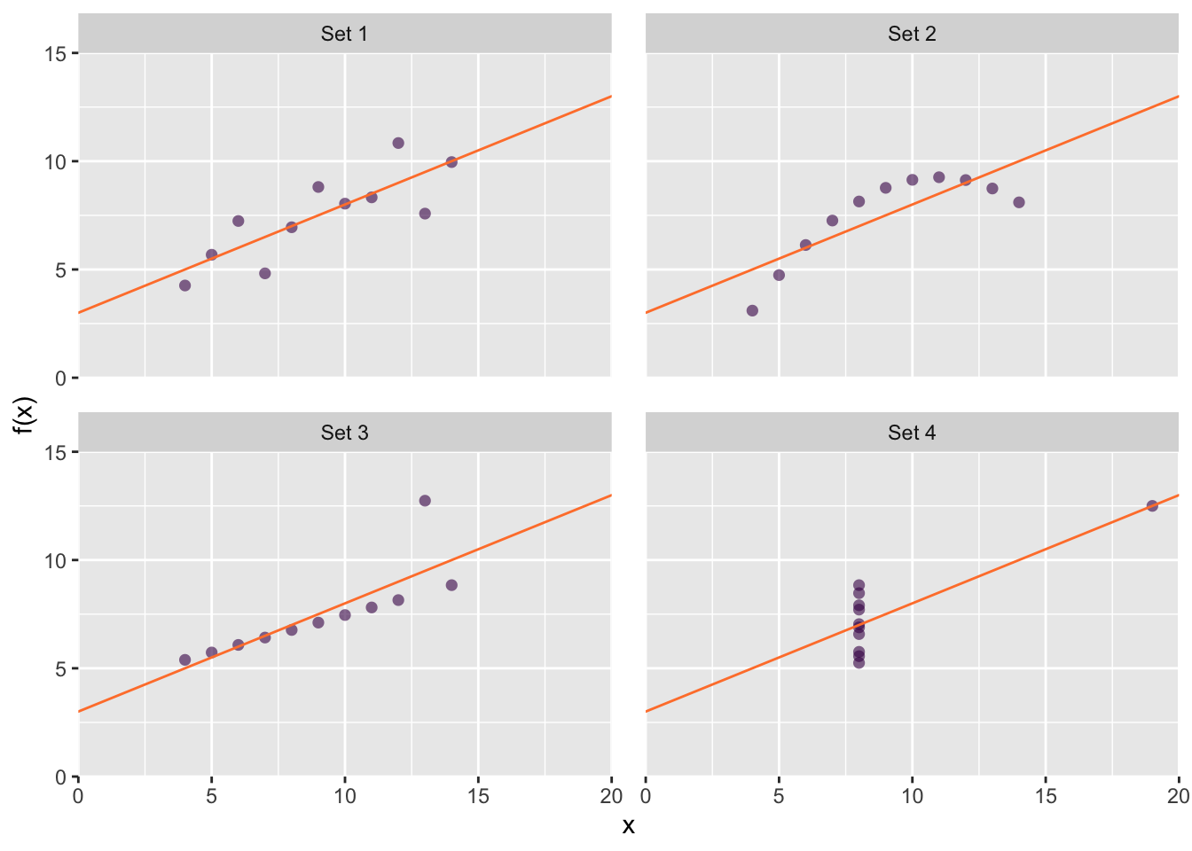
Data visualizations are a form of graphical data analysis, i.e. a part of your analytical tool-kit Thus, we must appreciate the intimate link between graphics and statistics, in particular when using graphics as a first step in exploratory data analysis. A classic example of this concept is Anscombe’s plots, shown in Figure 67.1. In each plot a different data set is described not only by the same linear model, \(\hat{y_i} = 3.0 + 0.5x_i\), but also by the same correlation coefficient, \(r = 0.82\). Each plot tells a strikingly different story, but in this case, the statistical analysis performed does not provide enough information about the underlying distribution of the data.
Figure 67.1: Anscombe’s plots. Although their distributions are distinct, each data set is described by the same linear model and correlation coefficient. Relying on numerical analysis alone does not tell the complete story.
As another example, let’s consider the relationship between mammalian body weight and brain weight, working with a small data set of representative members from 62 species. The head and tail of our data set are given in Table 67.1:
Species
Body weight (Kg)
Brain weight (g)
African elephant
\(6 654.000\)
\(5 712.00\)
Asian elephant
\(2 547.000\)
\(4 603.00\)
Giraffe
\(529.000\)
\(680.00\)
Horse
\(521.000\)
\(655.00\)
Cow
\(465.000\)
\(423.00\)
\(\vdots\)
\(\vdots\)
\(\vdots\)
Musk shrew
\(0.048\)
\(0.33\)
Big brown bat
\(0.023\)
\(0.30\)
Mouse
\(0.023\)
\(0.40\)
Little brown bat
\(0.010\)
\(0.25\)
Lesser short-tailed shrew
\(0.005\)
\(0.14\)
Table 67.1: The tail ends of the mammalian body and brain weight data set.
Looking at the data, our first problem becomes apparent — both variables have extremely large ranges. That’s not surprising, and we’d probably come to this conclusion just by thinking about what we expect to see. Further consideration would lead us to the reasonable assumption that both variables are heavily positively skewed. This is pre-existing information we have about our data before we even plot it. It’s likely that you have pre-existing knowledge of your data and the expected distribution because of your domain expertise.
Domain expertise allows us to anticipate appropriate data visualizations before actually working on the data.
If you are an experimentalist, it’s important that you don’t discount your domain knowledge. In particular, the relationship between variables, purpose of the experiment of expected distributions will all come in handy when visualizing, like performing any statistics. When consulting a data scientist or colleague for help, be clear and forthcoming about what you anticipate the data will look like, especially if they are not familiar with your experiments.
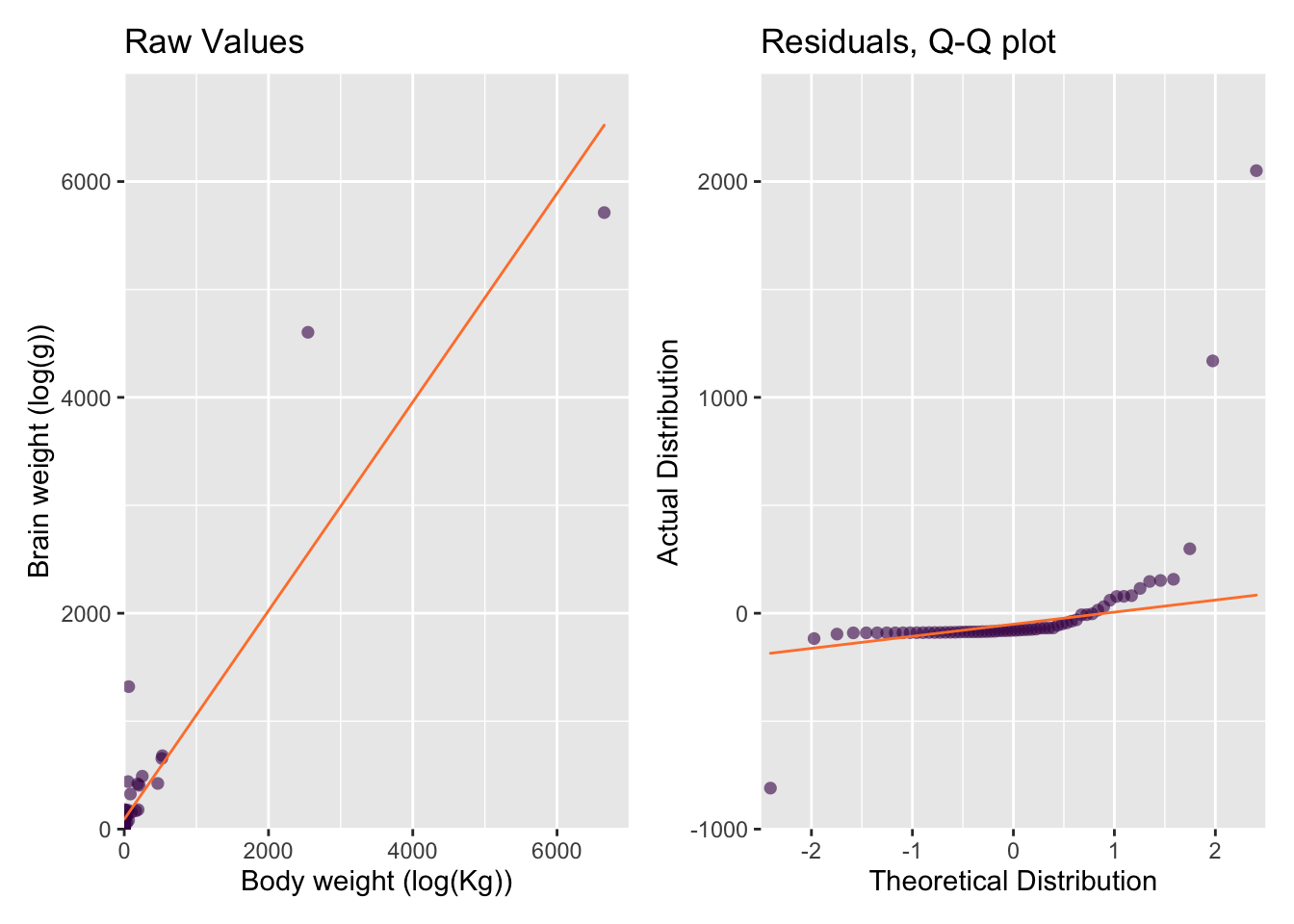
We can already see that it’s going to be difficult to plot such disparate values on a single plot, but let’s give it a go! To understand the relationship between the two variables, scatter plots are a logical first choice, as shown in fig. Figure 67.2, left, See ?sec-ScatterPlots for more details on scatter plots.
Our initial plot confirms what we already guessed — both variables are heavily positively skewed — making our scatter plot difficult to interpret. This is the first and most typical use of exploratory plots:
Exploratory plots allow you to assess the quality and distribution of your data during EDA.
But there is another equally important use of exploratory plots at this stage.
Exploratory plots encompase diagnostic plots that allow you to assess the quality of your statistical methods.
In this sense we use data visualization as a statistical tool. For example, here, we’d like to calculate the relationship between brain and body weight using a linear model (Figure 67.2, top).
Given that both variables are positively skewed and the two Elephant species have an enormous influence, this model is not really appropriate.
In a well-fit model, the distribution of the residuals — the distance between each observed and predicted \(y\) value, \(y_i - \hat{y}\), should be Normal. In our case that means that the differences between the observed and predicted brain weights should be Normally distributed. A typical and useful diagnostic plot for for assessing distributions is a Quartile-Quartile (Q-Q) plot. For now, all we need to know is that the more closely our residuals (the dots) fall onto the Q-Q line (Figure 67.2, bottom), the farther they are from a normal distribution. This confirms our suspicions that our model is not really the best choice.
The two extreme values from the African and Asian Elephants will also have a large influence on the linear model compared to the small values clustered near the origin. Visualizing influencers is a great diagnostic plot that you can use to asses you models.
Figure 67.2: An exploratory scatter plot of mammalian brain vs body weight described by a linear model.
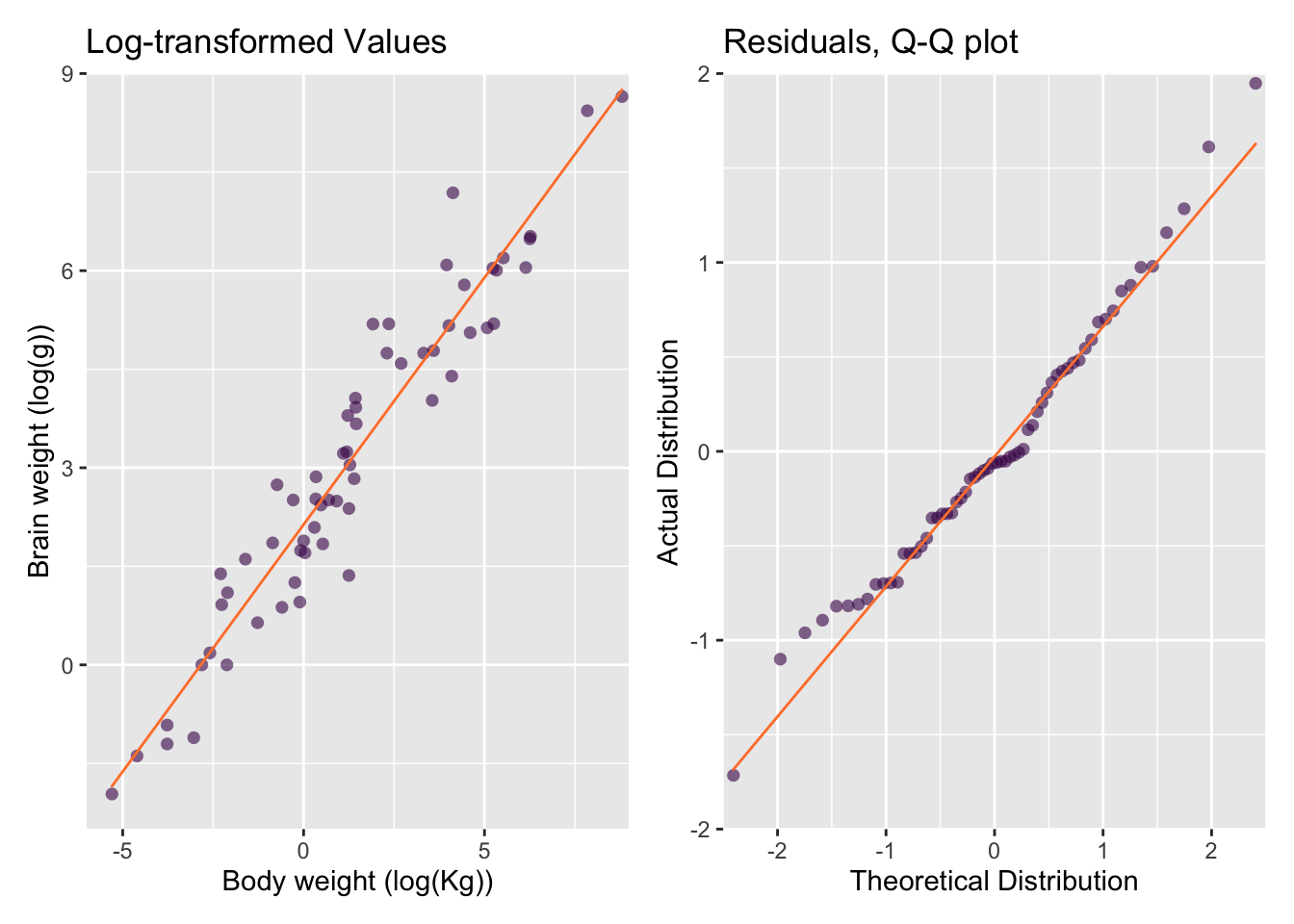
So far, our exploratory plots revealed that the data set is poorly-presented in its present state and also poorly-described by our linear model. A solution is to use log-transformed data. The scatter plot of the log-transformed data-set allows each data point to be distinguished (Figure 67.3, top) and reveals that a log-linear model is much more appropriate. The residuals of the linear model also fit the normal distribution much better (Figure 67.3, bottom).
Figure 67.3: An exploratory scatter plot of the log-transformed mammal dataset.
Remember, transformation functions are often used to adjust for some amount of positive or negative skew in the data. \(log_e\), \(log_2\) and \(log_{10}\) are very common and many models perform better with log-log, log-linear, or linear-log relationships.
Barnett, Adrian, and Nicole White. 2024. “Something is off-base with this title: P esteems, statical significance and more slapdash stats.”Significance 21 (1): 11–13. https://doi.org/10.1093/jrssig/qmae007.
Bjork, Robert A, and Elizabeth L Bjork. 2011. “Making Things Hard on Yourself, but in a Good Way: Creating Desirable Difficulties to Enhance Learning.” In Psychology and the Real World: Essays Illustrating Fundamental Contributions to Society, edited by Morton A Gernsbacher, Robert W Pew, Leah M Hough, and James R Pomerantz, 56–64. Worth Publishers.
Briscoe, M. H. 2012. Preparing Scientific Illustrations: A Guide to Better Posters, Presentations, and Publications. Springer New York. https://books.google.de/books?id=mYTlBwAAQBAJ.
Cepeda, Nicholas J, Harold Pashler, Edward Vul, John T Wixted, and Doug Rohrer. 2006. “Distributed Practice in Verbal Recall Tasks: A Review and Quantitative Synthesis.”Psychological Bulletin 132 (3): 354–80.
Chasson, Gregory, and Sara R. Jarosiewicz. 2014. “Social Competence Impairments in Autism Spectrum Disorders.” In Comprehensive Guide to Autism, edited by Vinood B. Patel, Victor R. Preedy, and Colin R. Martin, 1099–1118. New York, NY: Springer New York. https://doi.org/10.1007/978-1-4614-4788-7_60.
Cheeseman, Ian H., Natalia Gomez-Escobar, Celine K. Carret, Alasdair Ivens, Lindsay B. Stewart, Kevin KA Tetteh, and David J. Conway. 2009. “Gene Copy Number Variation Throughout the Plasmodium Falciparum Genome.”BMC Genomics 10 (1): 353. https://doi.org/10.1186/1471-2164-10-353.
Daston, L., and P. Galison. 2007. Objectivity. Book Collections on Project MUSE. Zone Books.
Diemand-Yauman, Connor, Daniel M Oppenheimer, and Erikka B Vaughan. 2011. “Fortune Favors the Bold (and the Italicized): Effects of Disfluency on Educational Outcomes.”Cognition.
Hench, Virginia K., and Lishan Su. 2011. “Regulation of IL-2 Gene Expression by Siva and FOXP3 in Human t Cells.”BMC Immunology 12 (1): 54. https://doi.org/10.1186/1471-2172-12-54.
Hill, Jennifer, and Maria Singer. 2014. “A Comparison of Print and Digital Reading Comprehension by Middle School Students.”Reading Research Quarterly 49 (2): 185–203. https://doi.org/10.1002/rrq.68.
Lupton, E. 2010. Thinking with Type, 2nd Revised and Expanded Edition: A Critical Guide for Designers, Writers, Editors, & Students. Princeton Architectural Press. https://books.google.de/books?id=Y_NVRQAACAAJ.
Mangen, Anne, and Don Kuiken. 2014. “Lost in an iPad: Narrative Engagement on Paper and Tablet.”Scientific Study of Literature 4 (2): 150–77. https://doi.org/10.1075/ssol.4.2.01man.
Mangen, Anne, Bente R Walgermo, and Kolbjørn Brønnick. 2013. “Reading Linear Texts on Paper Versus Computer Screen: Effects on Reading Comprehension.”International Journal of Educational Research 58: 61–68. https://doi.org/10.1016/j.ijer.2012.12.002.
Margolin, Sara J, Christine Driscoll, Michael J Toland, and Jessica L Kegler. 2013. “E-Readers, Computer Screens, or Paper: Does Reading Comprehension Change Across Media Platforms?”Applied Cognitive Psychology 27 (4): 512–19. https://doi.org/10.1002/acp.2930.
Murayama, Hiroshi, Yusuke Takagi, Hirokazu Tsuda, and Yuri Kato. 2023. “Applying Nudge to Public Health Policy: Practical Examples and Tips for Designing Nudge Interventions.”International Journal of Environmental Research and Public Health. MDPI. https://doi.org/10.3390/ijerph20053962.
producer, Stephen Lambert ;. written executive, and produced by Adam Curtis ;. RDF Television; BBC. [2009?]. “The Century of the Self.” Standard format. Wyandotte, MI : BigD Productions, [2009?]. https://search.library.wisc.edu/catalog/9910135083802121.
Roediger, Henry L, and Jeffrey D Karpicke. 2006. “Test-Enhanced Learning: Taking Memory Tests Improves Long-Term Retention.”Psychological Science 17 (3): 249–55.
Rohrer, Doug, and Kelli Taylor. 2007. “The Shuffling of Mathematics Problems Improves Learning.”Instructional Science 35 (6): 481–98.
Roßa, N. 2017. Sketchnotes: Visuelle Notizen für Alles. frechverlag.
———. 2020. Sketchnotes: Die Große Symbol-Bibliothek. frechverlag.
Rousselet, Guillaume A, John J Foxe, and J Paul Bolam. 2016. “A Few Simple Steps to Improve the Description of Group Results in Neuroscience.”Eur. J. Neurosci. 44 (9): 2647–51.
Sanges, Remo, Yavor Hadzhiev, Marion Gueroult-Bellone, Agnes Roure, Marco Ferg, Nicola Meola, Gabriele Amore, et al. 2013. “Highly conserved elements discovered in vertebrates are present in non-syntenic loci of tunicates, act as enhancers and can be transcribed during development.”Nucleic Acids Research 41 (6): 3600–3618. https://doi.org/10.1093/nar/gkt030.
Singer, Leona M, Patricia A Alexander, and Deborah D Reese. 2014. “Reading on Paper and Digitally: What the Past Decades of Empirical Research Reveal.”Review of Educational Research 84 (4): 509–45. https://doi.org/10.3102/0034654314541101.
Slamecka, Norman J, and Peter Graf. 1978. “The Generation Effect: Delineation of a Phenomenon.”Journal of Experimental Psychology: Human Learning and Memory 4 (6): 592–604.
“Status of Mind - social media and young people’s mental health and wellbeing.” 2017. Royal Society for Public Health.
Wästlund, Erik, Lars Nilsson, and Kenneth Holmqvist. 2012. “Eye Movement Patterns and Reading Processes in Eye-Friendly and Non-Eye-Friendly Typography.”Information Design Journal 19 (2): 119–32.