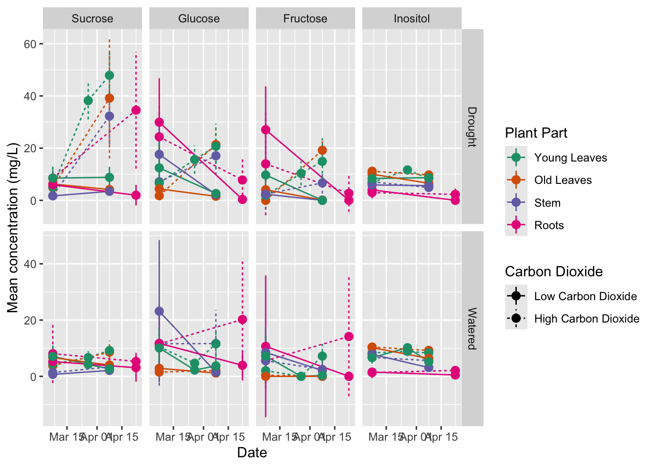
Now that we have an idea about some of the geometries available to us, we will use a simple case study to extend this idea to a multivariate comparison. This serves as an introduction to the concepts we will explore in detail in the next chapter.
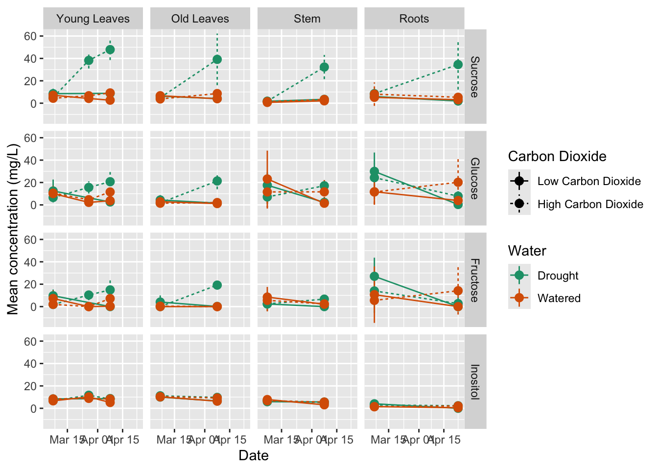
This data-set comes from a doctoral student at the Max Planck Institute for Biogeochemistry in Jena. She was interested in uncovering the effects of possible future climate conditions on sugar production in a plant - namely peppermint. She measured the sugar concentrations of three sugars at a few time points over several weeks in four different plant parts. She grew the plants under normal water conditions or drought and under low or high carbon dioxide concentrations.
In total, she had over 741 data points classified into 48 different time series (consisting of 2 water conditions, 2 \(CO_2\) conditions, 4 plant parts, and 3 sugars). In keeping with the original plot, I have plotted the means and standard errors for each time point. Note that this produces smaller error bars than the \(95\%\ CI\) or the standard deviation, which are more easily understood.
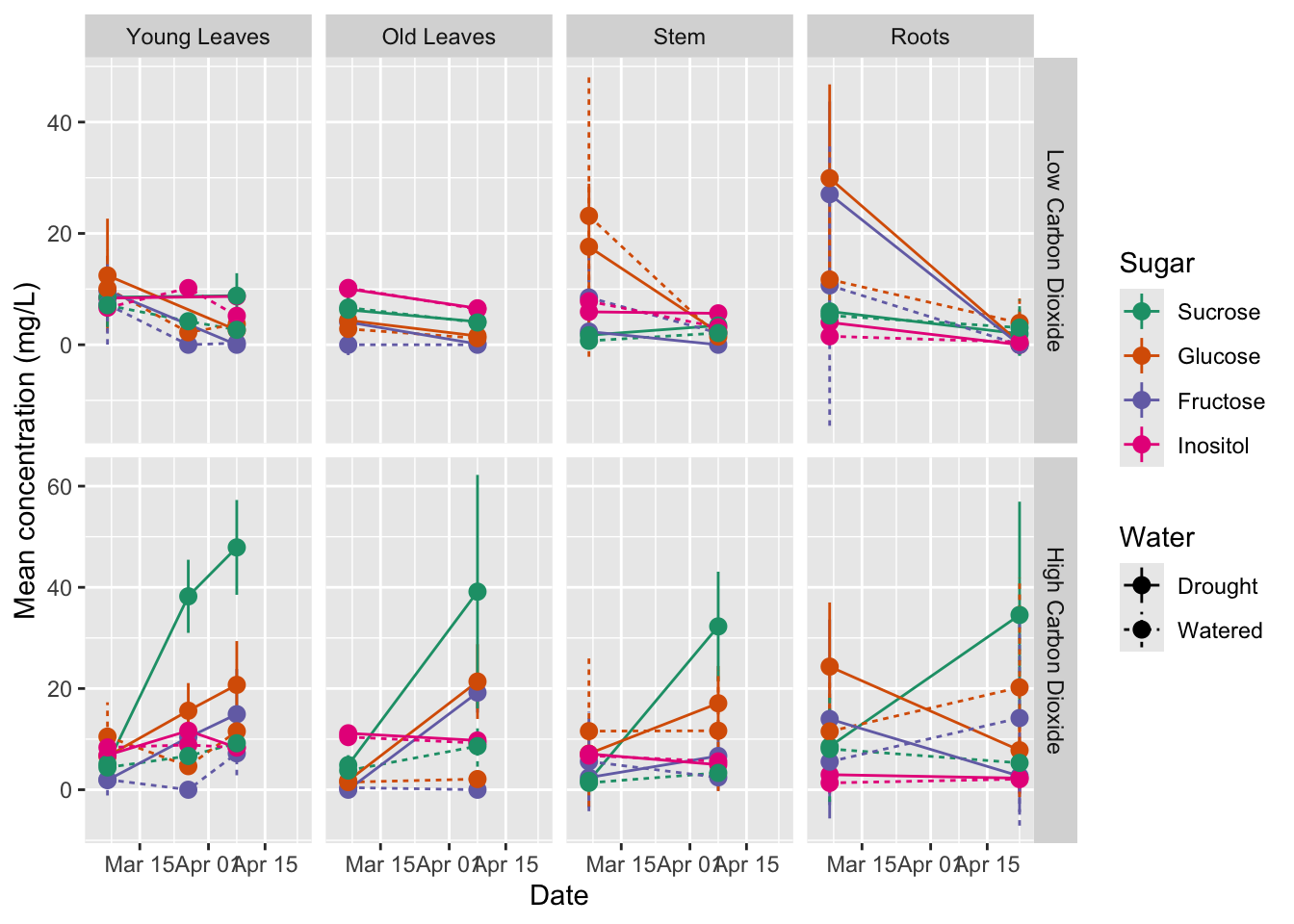
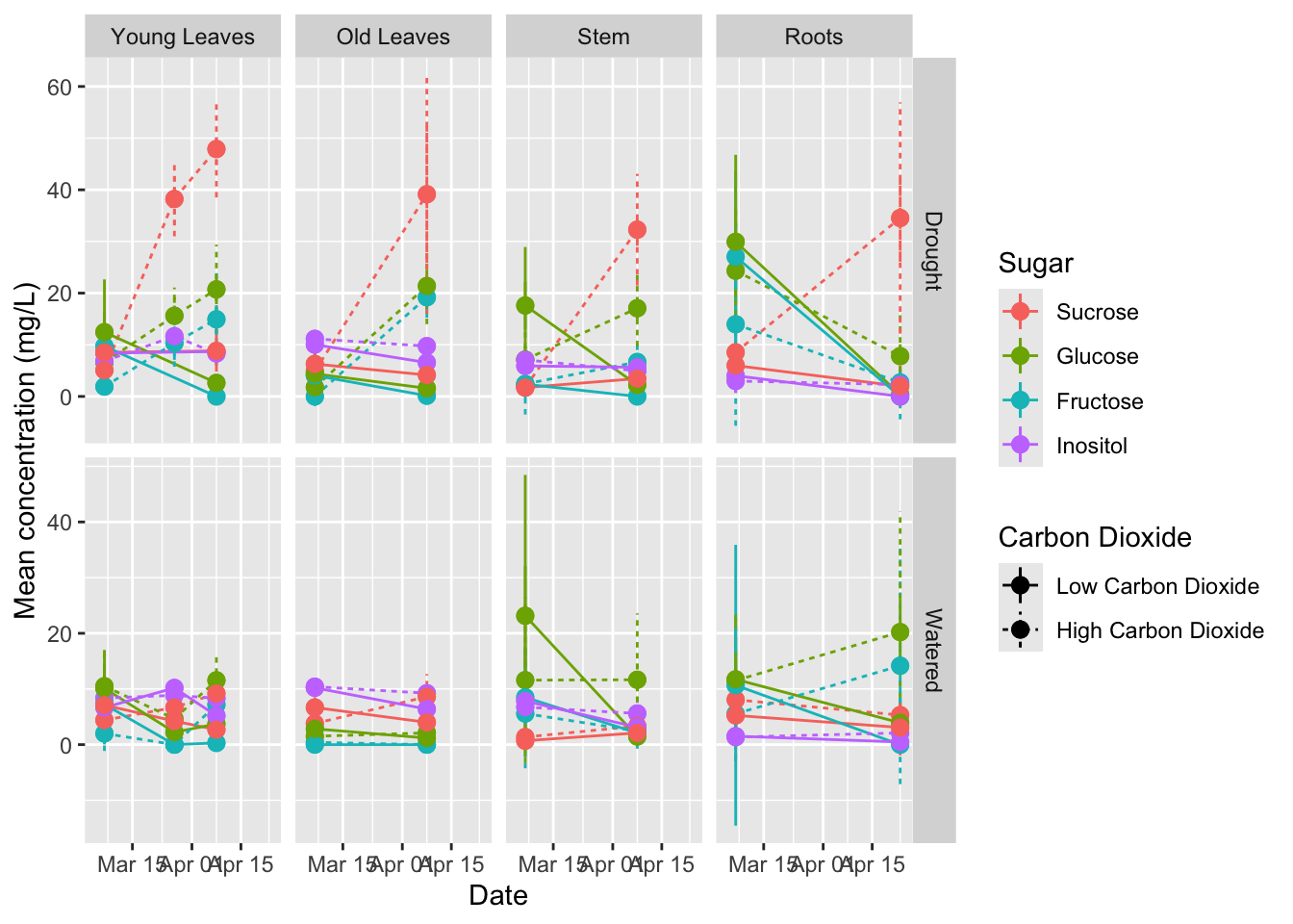
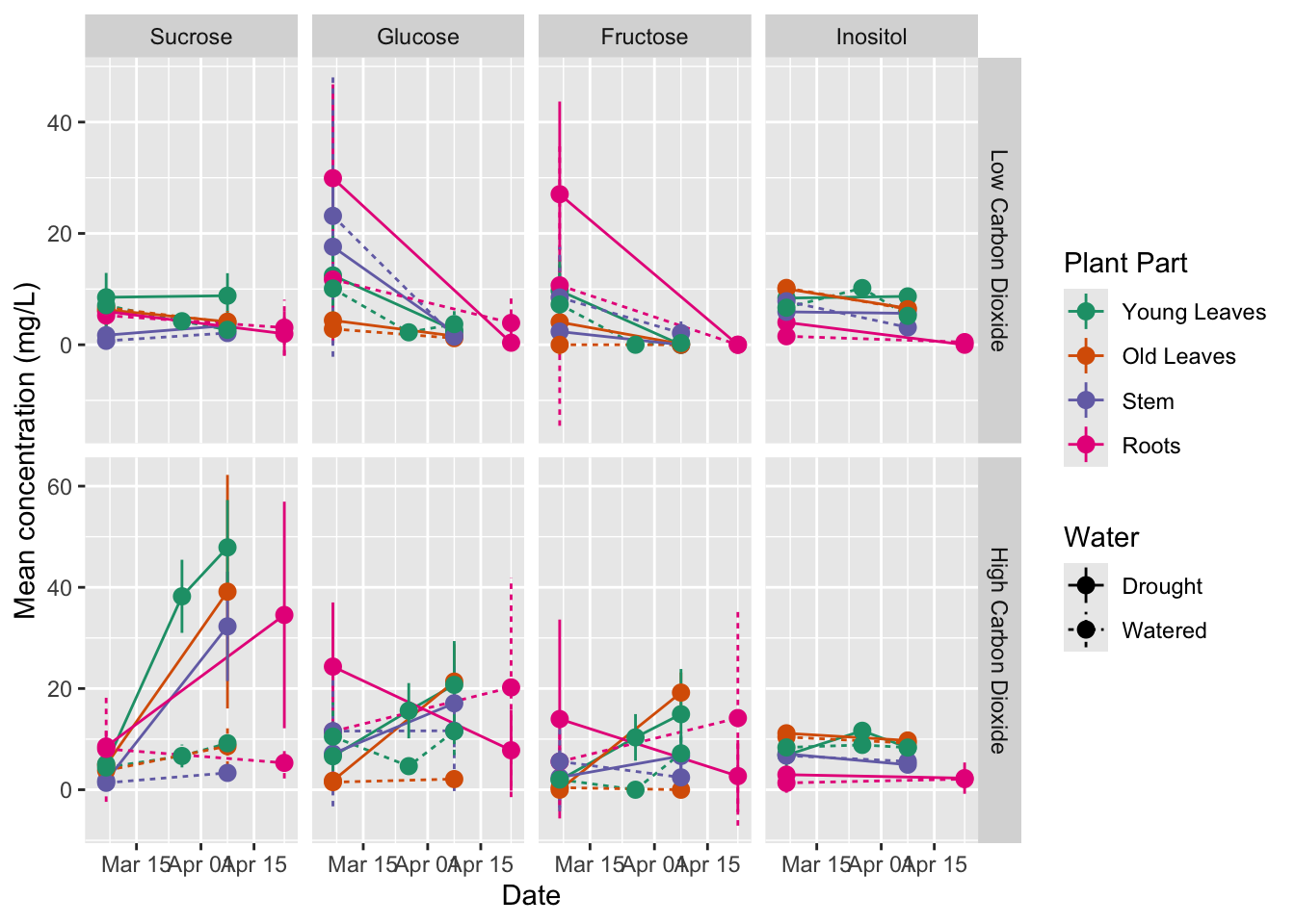
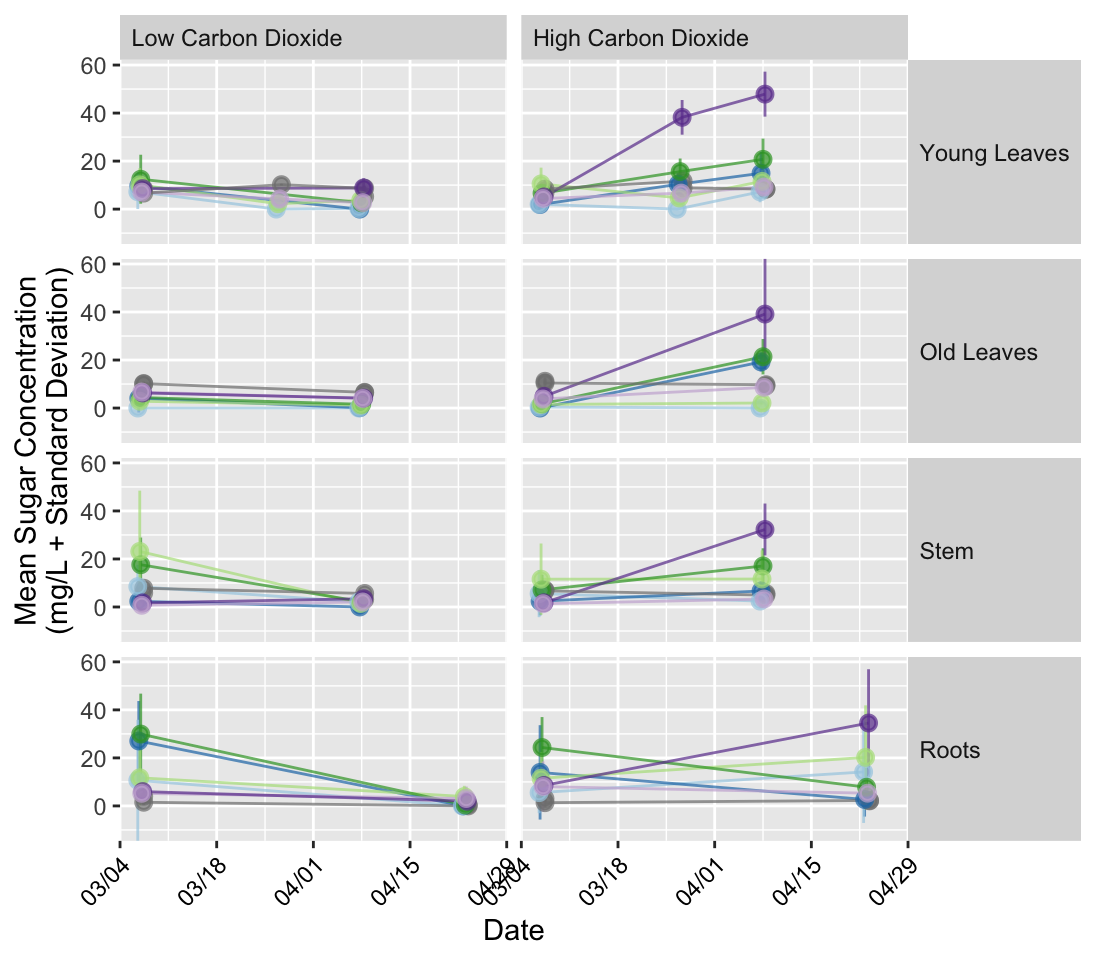
She began by grouping this into 12 plots according to sugar and plant type. This is our starting point and is shown at the top of the page overleaf. Above the plot is a schematic of the grammar of graphics I used to create it - the blue lines depict the mapping of data onto aesthetics and facets. The plots which follow are variations on this theme and are intended to showcase how changing mapping attributes affects how we communicate information. Subtle changes in mapping can have dramatic effects on information perception.
Barnett, Adrian, and Nicole White. 2024.
“Something is off-base with this title: P esteems, statical significance and more slapdash stats.” Significance 21 (1): 11–13.
https://doi.org/10.1093/jrssig/qmae007.
Berger, J. 2008.
Ways of Seeing. Penguin Modern Classics. Penguin Books Limited.
https://books.google.de/books?id=QxdperNq5R8C.
Berne, E. 2011.
Games People Play: The Basic Handbook of Transactional Analysis. Tantor Media, Incorporated.
https://books.google.de/books?id=D9dOBAAAQBAJ.
Bilz, S., R. Klanten, and M. Mischler. 2011.
The Little Know-It-All: Common Sense for Designers. Gestalten.
https://books.google.de/books?id=JA8FfAEACAAJ.
Bjork, Robert A, and Elizabeth L Bjork. 2011. “Making Things Hard on Yourself, but in a Good Way: Creating Desirable Difficulties to Enhance Learning.” In Psychology and the Real World: Essays Illustrating Fundamental Contributions to Society, edited by Morton A Gernsbacher, Robert W Pew, Leah M Hough, and James R Pomerantz, 56–64. Worth Publishers.
Bloom, P. 2016.
Against Empathy: The Case for Rational Compassion. HarperCollins.
https://books.google.de/books?id=op67CwAAQBAJ.
Bringhurst, R. 2004.
The Elements of Typographic Style. Elements of Typographic Style. Hartley & Marks, Publishers.
https://books.google.de/books?id=940sAAAAYAAJ.
Briscoe, M. H. 2012.
Preparing Scientific Illustrations: A Guide to Better Posters, Presentations, and Publications. Springer New York.
https://books.google.de/books?id=mYTlBwAAQBAJ.
Cepeda, Nicholas J, Harold Pashler, Edward Vul, John T Wixted, and Doug Rohrer. 2006. “Distributed Practice in Verbal Recall Tasks: A Review and Quantitative Synthesis.” Psychological Bulletin 132 (3): 354–80.
Chasson, Gregory, and Sara R. Jarosiewicz. 2014.
“Social Competence Impairments in Autism Spectrum Disorders.” In
Comprehensive Guide to Autism, edited by Vinood B. Patel, Victor R. Preedy, and Colin R. Martin, 1099–1118. New York, NY: Springer New York.
https://doi.org/10.1007/978-1-4614-4788-7_60.
Cheeseman, Ian H., Natalia Gomez-Escobar, Celine K. Carret, Alasdair Ivens, Lindsay B. Stewart, Kevin KA Tetteh, and David J. Conway. 2009.
“Gene Copy Number Variation Throughout the Plasmodium Falciparum Genome.” BMC Genomics 10 (1): 353.
https://doi.org/10.1186/1471-2164-10-353.
Cherry, C. 1980.
On Human Communication: A Review, a Survey, and a Criticism. MIT Press Classics. MIT Press.
https://books.google.de/books?id=kQwqSwAACAAJ.
Daston, L., and P. Galison. 2007. Objectivity. Book Collections on Project MUSE. Zone Books.
Diemand-Yauman, Connor, Daniel M Oppenheimer, and Erikka B Vaughan. 2011. “Fortune Favors the Bold (and the Italicized): Effects of Disfluency on Educational Outcomes.” Cognition.
Hamming, R., and B. Victor. 2020. The Art of Doing Science and Engineering: Learning to Learn. Stripe Matter Incorporated.
Hench, Virginia K., and Lishan Su. 2011.
“Regulation of IL-2 Gene Expression by Siva and FOXP3 in Human t Cells.” BMC Immunology 12 (1): 54.
https://doi.org/10.1186/1471-2172-12-54.
Hill, Jennifer, and Maria Singer. 2014.
“A Comparison of Print and Digital Reading Comprehension by Middle School Students.” Reading Research Quarterly 49 (2): 185–203.
https://doi.org/10.1002/rrq.68.
Hofmann, A. H. 2020.
Scientific Writing and Communication: Papers, Proposals, and Presentations. Oxford University Press.
https://books.google.de/books?id=vQXuxAEACAAJ.
Jeffares, A. N., and M. B. Davies. 1958.
The Scientific Background: A Prose Anthology. Pitman.
https://books.google.de/books?id=F_gLAQAAIAAJ.
Kahneman, D. 2011.
Thinking, Fast and Slow. Farrar, Straus; Giroux.
https://books.google.com.ec/books?id=ZuKTvERuPG8C.
Lupton, E. 2010.
Thinking with Type, 2nd Revised and Expanded Edition: A Critical Guide for Designers, Writers, Editors, & Students. Princeton Architectural Press.
https://books.google.de/books?id=Y_NVRQAACAAJ.
Mangen, Anne, and Don Kuiken. 2014.
“Lost in an iPad: Narrative Engagement on Paper and Tablet.” Scientific Study of Literature 4 (2): 150–77.
https://doi.org/10.1075/ssol.4.2.01man.
Mangen, Anne, Bente R Walgermo, and Kolbjørn Brønnick. 2013.
“Reading Linear Texts on Paper Versus Computer Screen: Effects on Reading Comprehension.” International Journal of Educational Research 58: 61–68.
https://doi.org/10.1016/j.ijer.2012.12.002.
Margolin, Sara J, Christine Driscoll, Michael J Toland, and Jessica L Kegler. 2013.
“E-Readers, Computer Screens, or Paper: Does Reading Comprehension Change Across Media Platforms?” Applied Cognitive Psychology 27 (4): 512–19.
https://doi.org/10.1002/acp.2930.
Murayama, Hiroshi, Yusuke Takagi, Hirokazu Tsuda, and Yuri Kato. 2023.
“Applying Nudge to Public Health Policy: Practical Examples and Tips for Designing Nudge Interventions.” International Journal of Environmental Research and Public Health. MDPI.
https://doi.org/10.3390/ijerph20053962.
producer, Stephen Lambert ;. written executive, and produced by Adam Curtis ;. RDF Television; BBC. [2009?].
“The Century of the Self.” Standard format. Wyandotte, MI : BigD Productions, [2009?].
https://search.library.wisc.edu/catalog/9910135083802121.
Roediger, Henry L, and Jeffrey D Karpicke. 2006. “Test-Enhanced Learning: Taking Memory Tests Improves Long-Term Retention.” Psychological Science 17 (3): 249–55.
Rohrer, Doug, and Kelli Taylor. 2007. “The Shuffling of Mathematics Problems Improves Learning.” Instructional Science 35 (6): 481–98.
Roman, K., and J. Raphaelson. 2010.
Writing That Works, 3rd Edition: How to Communicate Effectively in Business. HarperCollins.
https://books.google.de/books?id=3Rcv5CmGYf0C.
Roßa, N. 2017. Sketchnotes: Visuelle Notizen für Alles. frechverlag.
———. 2020. Sketchnotes: Die Große Symbol-Bibliothek. frechverlag.
Rousselet, Guillaume A, John J Foxe, and J Paul Bolam. 2016. “A Few Simple Steps to Improve the Description of Group Results in Neuroscience.” Eur. J. Neurosci. 44 (9): 2647–51.
Sanges, Remo, Yavor Hadzhiev, Marion Gueroult-Bellone, Agnes Roure, Marco Ferg, Nicola Meola, Gabriele Amore, et al. 2013.
“Highly conserved elements discovered in vertebrates are present in non-syntenic loci of tunicates, act as enhancers and can be transcribed during development.” Nucleic Acids Research 41 (6): 3600–3618.
https://doi.org/10.1093/nar/gkt030.
Shannon, Claude Elwood. 1948.
“A Mathematical Theory of Communication.” The Bell System Technical Journal 27: 379–423.
http://plan9.bell-labs.com/cm/ms/what/shannonday/shannon1948.pdf.
Singer, Leona M, Patricia A Alexander, and Deborah D Reese. 2014.
“Reading on Paper and Digitally: What the Past Decades of Empirical Research Reveal.” Review of Educational Research 84 (4): 509–45.
https://doi.org/10.3102/0034654314541101.
Slamecka, Norman J, and Peter Graf. 1978. “The Generation Effect: Delineation of a Phenomenon.” Journal of Experimental Psychology: Human Learning and Memory 4 (6): 592–604.
“Status of Mind - social media and young people’s mental health and wellbeing.” 2017. Royal Society for Public Health.
Steed, S., and an O’Reilly Media Company Safari. 2019.
Empathy at Work. O’Reilly Media.
https://books.google.de/books?id=U-j8xAEACAAJ.
Wästlund, Erik, Lars Nilsson, and Kenneth Holmqvist. 2012. “Eye Movement Patterns and Reading Processes in Eye-Friendly and Non-Eye-Friendly Typography.” Information Design Journal 19 (2): 119–32.
Weschler, L. 2006.
Everything That Rises: A Book of Convergences. McSweeney’s Books.
https://books.google.de/books?id=dqefAAAAMAAJ.
Zinsser, W. 2012.
On Writing Well, 30th Anniversary Edition: An Informal Guide to Writing Nonfiction. HarperCollins.
https://books.google.de/books?id=mp16BDRDaYQC.