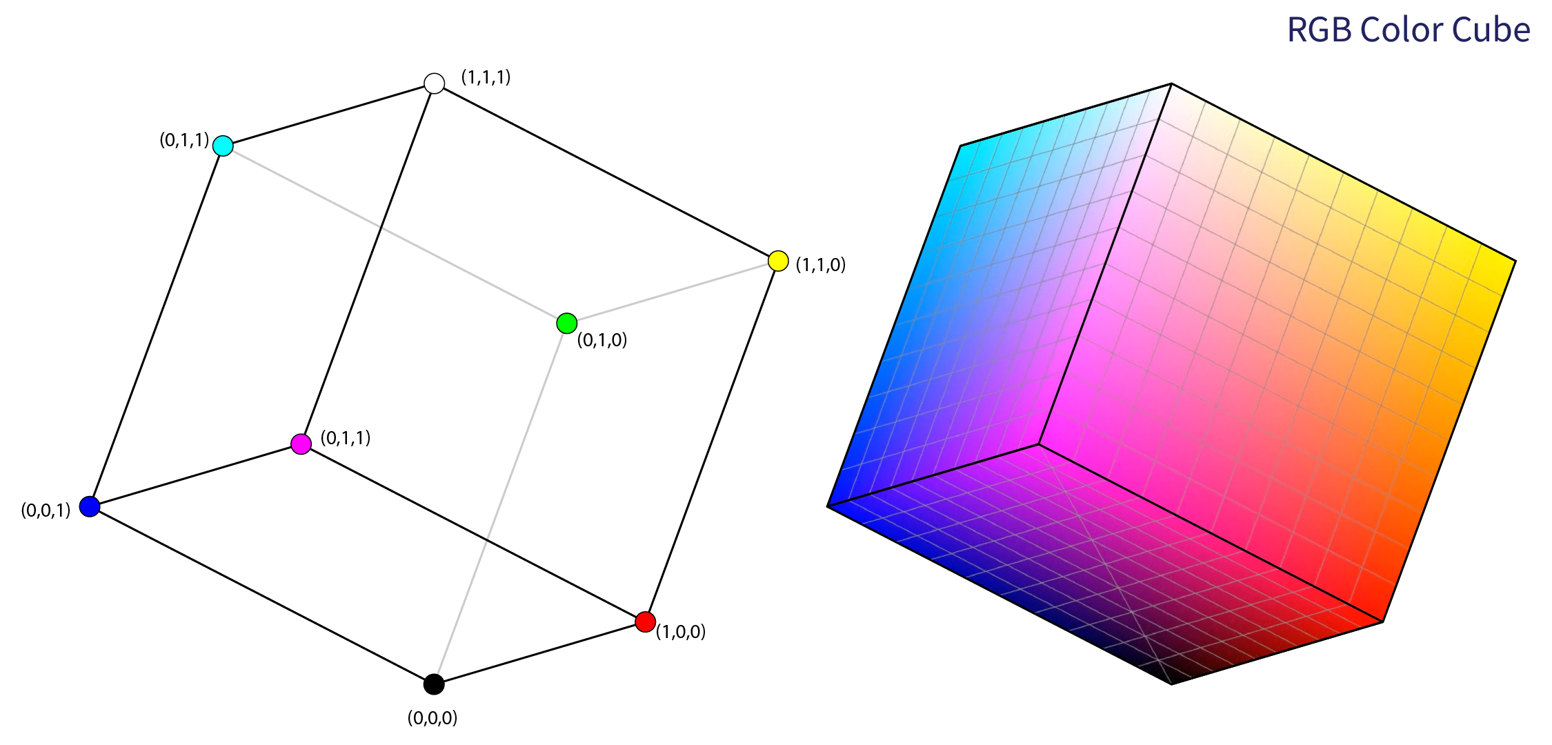
Color Models
Take-home Message
There are dozens of color classification systems, but an understanding of the main dimensions of color is sufficient for everyday purposes.
Color Spaces
Artists and scientists have defined scores of color spaces over the centuries. Whether artistic or mathematical, these models, like all models, are representations of “the real world” and attempt to help us understand and use color. They provide a common language for using color in a practical and reproducible way. Although we may never know if any two individuals perceive color in the exact same way, we can at least refer to it the same way.
A core motivation for defining color models is to establish reproducible definitions for a color. That may be for one person individually, so that they may reproduce the same color at a later time (think matching paint when repainting a room), or for standardization across devices or media, so that colors appear the same on all screens and print media. Here, I’ll describe some useful models for understanding color for screens and print.
Let’s begin with something we’re all familiar with — the visible light color spectrum, otherwise known as the rainbow, depicted in Figure fig-rainbow.

These are the colors we see when looking at a rainbow in the sky or the diffracted light through a prism. It’s a convenient starting point, and it already reveals an interesting trend. The range of visible light which results in a green color is quite broad, but that which produces a yellow color is quite narrow. We can already see that if we want to define a distance between colors we need to take this into account. Another observation, which we already knew but is worth recalling, is that there are no clean boundaries, visible light exists on a continuous spectrum.1 But importantly, we can also see that a rainbow as such is a poor model for understanding the complexity of color in the real world. For example, we know there are colors which are not depicted here. Where is the vibrant fluorescence of hot pink? The alluring shimmer of gold? The natural warmth of brown? These and the many other colors we are familiar with form the visible color gamut.
1 See wiki:Visible Spectrum
- The Visible Color Gamut
-
describes the range of colors in the visible light spectrum that can be perceived by the human eye. A one-dimensional color spectra does not model this well.
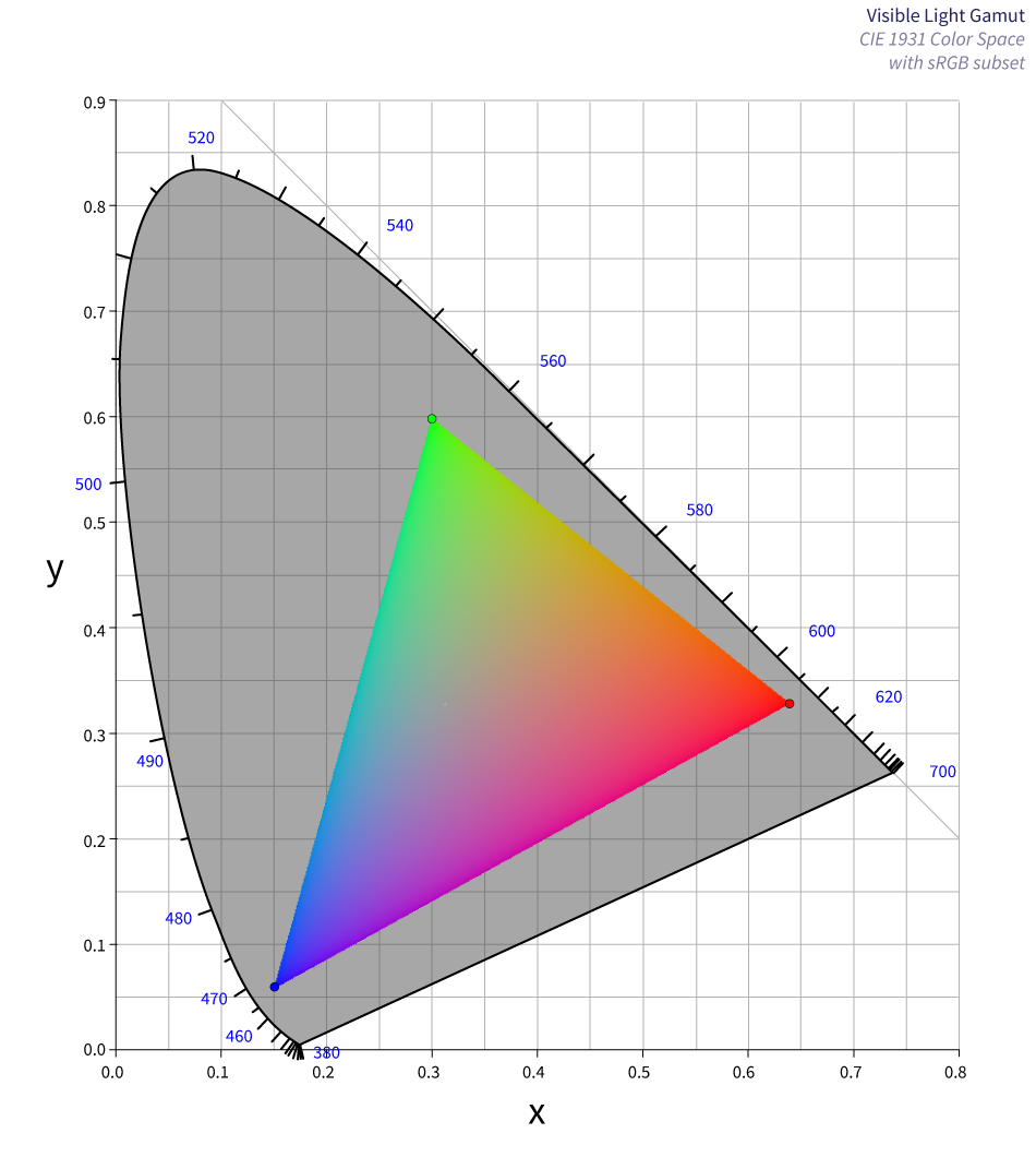
One model for defining the human visible color gamut was derived from experiments done on 17 individuals in the 1920s by two researchers (William David Wright and John Guild) and defined as CIE 2931 (for the International Commission on Illumination 1931).2
In the CIE-1931 RGB color space, \(y\) is the luminance and \(x\) is an index value of the the 3 spectral sensitivity curves of human cone cells (short-wavelength type sensitive to blue light, middle to green light, and long to red light). This is in #fig-CIE1931, where those parts of the visible color Gamut not reproduced by screens are shown in grey.
- Luminance
-
A quantitative metric (measured on a continuous scale) for the amount of light falling onto, aka illuminating, a surface area. This is akin to, but not the same as brightness, which is the non-quantitative perception from dim to bright.
Since values on \(x\) have a consistent luminance, we get an impression of the range of chromaticity for a given Luminance, as shown in Figure fig-srgb-slices.

- Chromaticity
-
A color described by its hue and saturation.
There are many ways to understand, or model, color and how different colors relate to each other. For our purposes, we’ll consider the four dimensions of color:
- Hue
-
What we typically refer to as the color, sometimes refered to as ROYGBIV for Red-Orange-Yellow-Green-Blue-Indigo-Violet.
- Lightness
-
A perceptual metric ranging from black to gray to white. Shades of a color containing more black and are darker. Tints or a color contain more white and are lighter.
- Saturation
-
The purity of the color. Low saturation colors converge onto grey.
- Alpha
-
The transparency/opacity of a color.
Munsell Color Space
A familiar way of understanding the relationship between hue, lightness and saturation is depicted in Figure fig-Munsell, a color system named after the painter Albert Henry Munsell.

We’ll set aside a detailed discussion of alpha until add link, for now let’s see how the hue, lightness and saturation affect how we use colors.