William Cleveland popularized the “table look-up” type of slow visual perception in the 1980s. This is a kind of visual perception typical with exploratory plots. It allows us to ask precise and detailed questions when we first begin to examine our data. They may make an appearance as explanatory plots, but because they are time-consuming to read, are less common. It also depends on the context and audience. You may see plots that activate slow forms of visual perception in specialist, data-heavy scientific journals, where the audience has the time and interest to pour over the details. In contrast, it’s unlikely that a large audience for a short conference presentation will get any meaningful information.
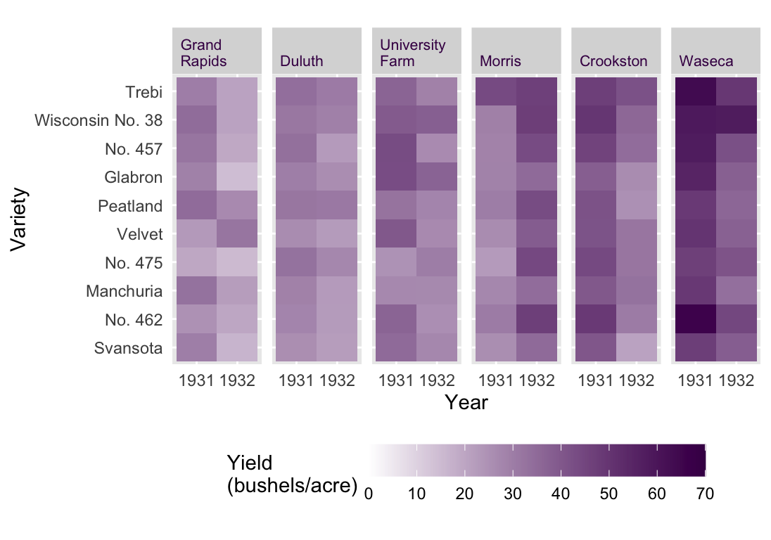
An example that Cleveland used to exemplify this concept is the Barley Yield data set. In this data set, the yield of 10 varieties of Barley in 1931 and 1932 are reported for 6 farms. That’s only 120 data points, so the issue is not too much data. Rather the issue is that we have 4 variables and 60 time series. The heat map presented in Figure 54.1 may be a first idea for a data visualization.1
1 Heat maps can be a good choice as an explanatory plot if there is an immediate and clear message or only a few, very different categories. As an exploratory plot, it is not detailed enough. Basically, it’s as if we have used conditional formatting in an Excel spreadsheet.
Figure 54.1: The Barley Yield data set as a Heat Map. All values are displayed but trends are difficult to observe.
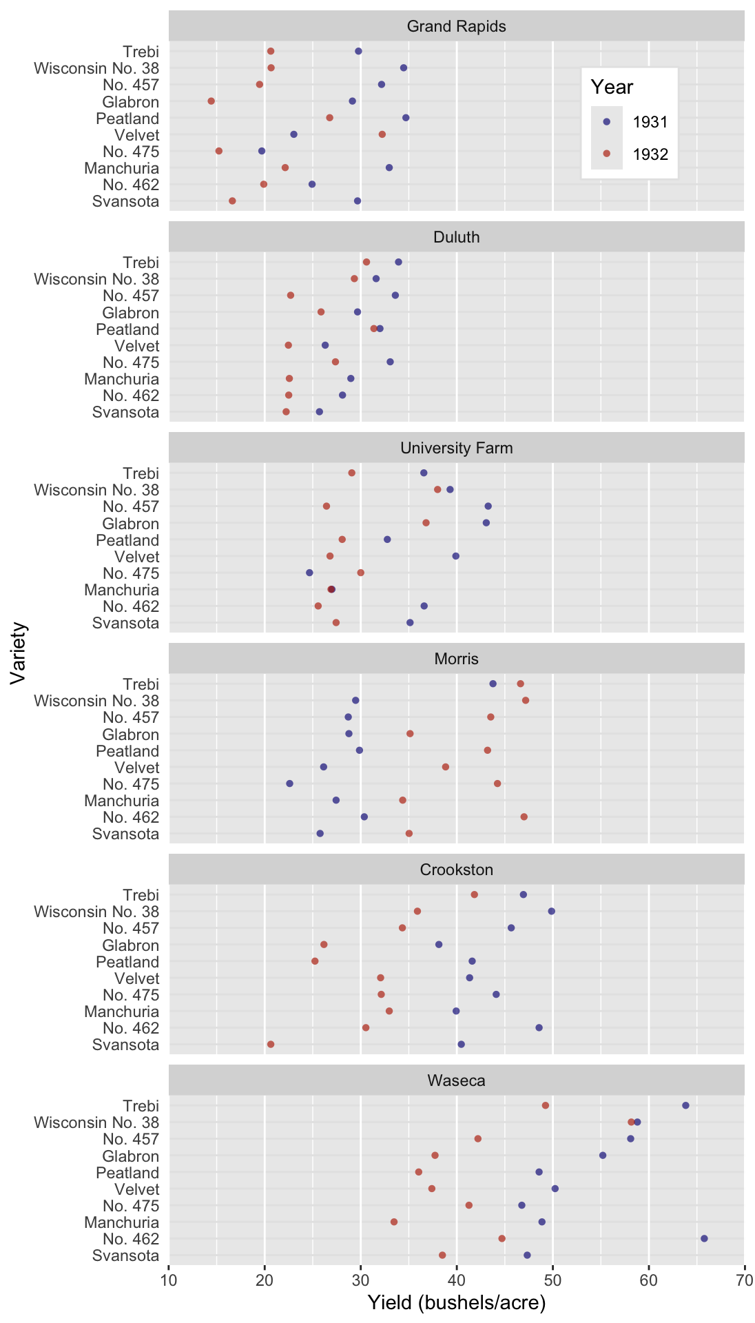
A much more detailed view would be Figure 54.2, a Cleveland-style dot plot. In this plot type, we make some unconventional choices. First, the independent variable is presented on the y axis and the dependent variable is on the x. It works, since the long labels of the Barley varieties are easy to read. Time is encoded by color, instead of taking its typical place on the x axis. This arrangement means that we can read the plot like a table, hence slow table look-up. We can ask very detailed questions and scan the plot (i.e. table) from left to right and from top to bottom to retrieve exactly the information we need.2
2 Remember, we can ask detailed questions, but precision is a different matter. Most data visualization suffers from some degree of imprecision, unless precise labels are added.
An example: Which variety had the worst yield in 1931 at the Waseca farm? All we have to do is move from top to bottom looking for the Waseca sub plot. Then we move from left to right looking for the first blue dot (the smallest value in 1931). It turns out to be No 475, which had a yield of ca. 47 bushels/acre. Try answering that with the heat map! Unless the value is striking, you’ll have a hard time.
Figure 54.2: A dot plot of the barley data set popularised by William Cleveland. Three variables representing 120 data points are plotted.
Figure 54.2 is the most data-heavy and time-consuming (to read) plot we could produce with this data set. But it’s not bad! It serves a specific purpose for an interested audience in the right context. Can you see some trends in the data set? Did you notice that the farms are arranged from low to high producers? That’s a useful feature. The sub-plots are not arranged alphabetically, further information is contained in their order! Also, notice that some farms have a low mean yield and variance, like Duluth, whereas others have a relatively large mean and variance, like Waseca. Did you also notice the anomaly in the data set? All farms suffered a decrease in yield from 1931 to 1932 except for Morris. The reason for this is a different, and somewhat contested, question. We’ll imagine that this is an interesting anomaly that we want to highlight.
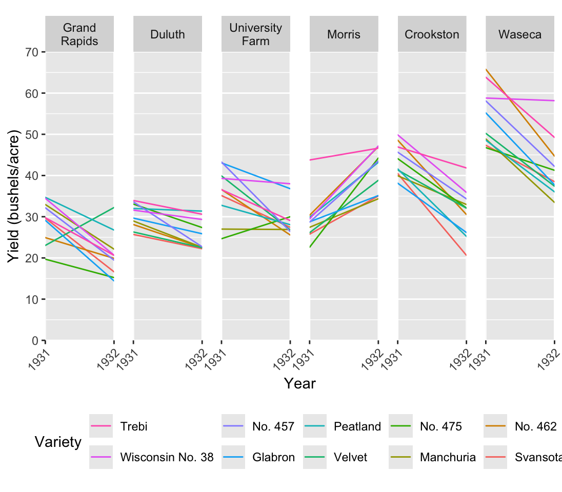
Systematic shifts in the location, spread or direction of change are important results that we typically want to highlight. They are not readily apparent in Figure 54.2. We need a plot type that allows us to communicate these messages a bit faster. A line plot, Figure 54.3, could come in handy here. In this case the most logical, and typical, choice for the x axis is going to be time.
Figure 54.3: Barley data set, Line Plot
Figure 54.3 is pretty detailed since we see all 60 time series. It’s still manageable, but consider that we have 10 distinct colors. We’re kind of pushing the limit on how many colors the human eye can easily distinguish. Nonetheless, we can see the trends we expected as we move from left to right. In particular we can see more clearly that Morris behaves differently compared to the other farms. On top of that we do gain some extra insights. For example, although many varieties decrease, some of them actually increase, and some are worse off than others.
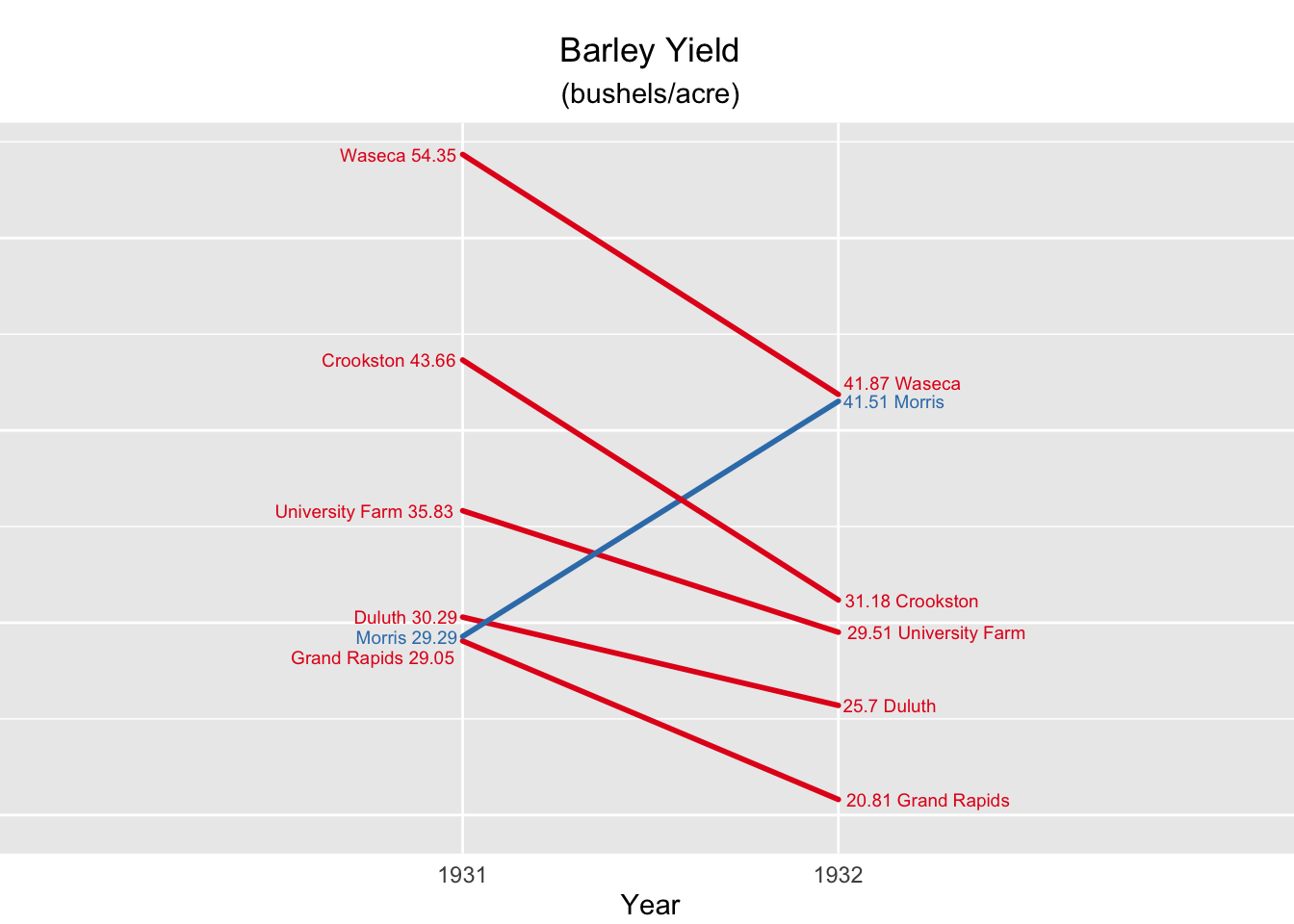
Edward Tufte, whom we’ll also encounter again later on in the workshop, developed a slope plot. For Tufte, an explanatory plot wasn’t complete until all non-data ink was removed. The slope plot in fig. (ref?)(fig:ClevelandSlope), does away with the axes. In their place are the actual mean values. So although it looks like we have lost precision, this is actually the most precise plot of the series since we know the exact value to two decimal places and we can see the values in a visual context. On top that Figure 54.4 communicates one very clear message by the clever use of color. Instead of coloring the lines according to farm, they are colored according to direction of change. Did the yield increase of decrease?
There are two disturbing things about this slope plot. First, there is no legend. Any visual element that encodes information should be defined somewhere on the plot. In this case we may make the argument that it is obvious and so goes without saying. That’s a dangerous perspective, but you may be able to get away with it. Second, the spread is not depicted, which is typical for slope plots. That should be a major cause of concern for scientists. You never want to show the location without some measure of spread. This plot is not suitable for a scientific publication, but it may work well for lay people or in a report for managers. It’s easy to read and communicates a clear message. Extra information like the standard deviation or the 95% interval may already be information overload and just confuse the audience.
Figure 54.4: Cleveland Barley data set slope plot.
Barnett, Adrian, and Nicole White. 2024. “Something is off-base with this title: P esteems, statical significance and more slapdash stats.”Significance 21 (1): 11–13. https://doi.org/10.1093/jrssig/qmae007.
Bjork, Robert A, and Elizabeth L Bjork. 2011. “Making Things Hard on Yourself, but in a Good Way: Creating Desirable Difficulties to Enhance Learning.” In Psychology and the Real World: Essays Illustrating Fundamental Contributions to Society, edited by Morton A Gernsbacher, Robert W Pew, Leah M Hough, and James R Pomerantz, 56–64. Worth Publishers.
Briscoe, M. H. 2012. Preparing Scientific Illustrations: A Guide to Better Posters, Presentations, and Publications. Springer New York. https://books.google.de/books?id=mYTlBwAAQBAJ.
Cepeda, Nicholas J, Harold Pashler, Edward Vul, John T Wixted, and Doug Rohrer. 2006. “Distributed Practice in Verbal Recall Tasks: A Review and Quantitative Synthesis.”Psychological Bulletin 132 (3): 354–80.
Chasson, Gregory, and Sara R. Jarosiewicz. 2014. “Social Competence Impairments in Autism Spectrum Disorders.” In Comprehensive Guide to Autism, edited by Vinood B. Patel, Victor R. Preedy, and Colin R. Martin, 1099–1118. New York, NY: Springer New York. https://doi.org/10.1007/978-1-4614-4788-7_60.
Cheeseman, Ian H., Natalia Gomez-Escobar, Celine K. Carret, Alasdair Ivens, Lindsay B. Stewart, Kevin KA Tetteh, and David J. Conway. 2009. “Gene Copy Number Variation Throughout the Plasmodium Falciparum Genome.”BMC Genomics 10 (1): 353. https://doi.org/10.1186/1471-2164-10-353.
Daston, L., and P. Galison. 2007. Objectivity. Book Collections on Project MUSE. Zone Books.
Diemand-Yauman, Connor, Daniel M Oppenheimer, and Erikka B Vaughan. 2011. “Fortune Favors the Bold (and the Italicized): Effects of Disfluency on Educational Outcomes.”Cognition.
Hench, Virginia K., and Lishan Su. 2011. “Regulation of IL-2 Gene Expression by Siva and FOXP3 in Human t Cells.”BMC Immunology 12 (1): 54. https://doi.org/10.1186/1471-2172-12-54.
Hill, Jennifer, and Maria Singer. 2014. “A Comparison of Print and Digital Reading Comprehension by Middle School Students.”Reading Research Quarterly 49 (2): 185–203. https://doi.org/10.1002/rrq.68.
Lupton, E. 2010. Thinking with Type, 2nd Revised and Expanded Edition: A Critical Guide for Designers, Writers, Editors, & Students. Princeton Architectural Press. https://books.google.de/books?id=Y_NVRQAACAAJ.
Mangen, Anne, and Don Kuiken. 2014. “Lost in an iPad: Narrative Engagement on Paper and Tablet.”Scientific Study of Literature 4 (2): 150–77. https://doi.org/10.1075/ssol.4.2.01man.
Mangen, Anne, Bente R Walgermo, and Kolbjørn Brønnick. 2013. “Reading Linear Texts on Paper Versus Computer Screen: Effects on Reading Comprehension.”International Journal of Educational Research 58: 61–68. https://doi.org/10.1016/j.ijer.2012.12.002.
Margolin, Sara J, Christine Driscoll, Michael J Toland, and Jessica L Kegler. 2013. “E-Readers, Computer Screens, or Paper: Does Reading Comprehension Change Across Media Platforms?”Applied Cognitive Psychology 27 (4): 512–19. https://doi.org/10.1002/acp.2930.
Murayama, Hiroshi, Yusuke Takagi, Hirokazu Tsuda, and Yuri Kato. 2023. “Applying Nudge to Public Health Policy: Practical Examples and Tips for Designing Nudge Interventions.”International Journal of Environmental Research and Public Health. MDPI. https://doi.org/10.3390/ijerph20053962.
producer, Stephen Lambert ;. written executive, and produced by Adam Curtis ;. RDF Television; BBC. [2009?]. “The Century of the Self.” Standard format. Wyandotte, MI : BigD Productions, [2009?]. https://search.library.wisc.edu/catalog/9910135083802121.
Roediger, Henry L, and Jeffrey D Karpicke. 2006. “Test-Enhanced Learning: Taking Memory Tests Improves Long-Term Retention.”Psychological Science 17 (3): 249–55.
Rohrer, Doug, and Kelli Taylor. 2007. “The Shuffling of Mathematics Problems Improves Learning.”Instructional Science 35 (6): 481–98.
Roßa, N. 2017. Sketchnotes: Visuelle Notizen für Alles. frechverlag.
———. 2020. Sketchnotes: Die Große Symbol-Bibliothek. frechverlag.
Rousselet, Guillaume A, John J Foxe, and J Paul Bolam. 2016. “A Few Simple Steps to Improve the Description of Group Results in Neuroscience.”Eur. J. Neurosci. 44 (9): 2647–51.
Sanges, Remo, Yavor Hadzhiev, Marion Gueroult-Bellone, Agnes Roure, Marco Ferg, Nicola Meola, Gabriele Amore, et al. 2013. “Highly conserved elements discovered in vertebrates are present in non-syntenic loci of tunicates, act as enhancers and can be transcribed during development.”Nucleic Acids Research 41 (6): 3600–3618. https://doi.org/10.1093/nar/gkt030.
Singer, Leona M, Patricia A Alexander, and Deborah D Reese. 2014. “Reading on Paper and Digitally: What the Past Decades of Empirical Research Reveal.”Review of Educational Research 84 (4): 509–45. https://doi.org/10.3102/0034654314541101.
Slamecka, Norman J, and Peter Graf. 1978. “The Generation Effect: Delineation of a Phenomenon.”Journal of Experimental Psychology: Human Learning and Memory 4 (6): 592–604.
“Status of Mind - social media and young people’s mental health and wellbeing.” 2017. Royal Society for Public Health.
Wästlund, Erik, Lars Nilsson, and Kenneth Holmqvist. 2012. “Eye Movement Patterns and Reading Processes in Eye-Friendly and Non-Eye-Friendly Typography.”Information Design Journal 19 (2): 119–32.