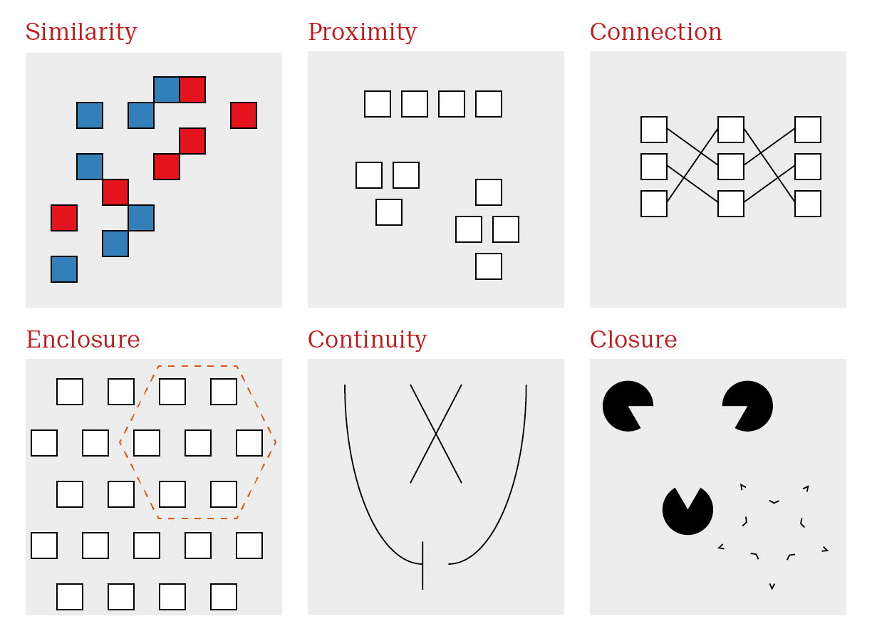
Gestalt is a German word that can be variously translated as design, form or shape. It encapsulates all of these ideas - the complete essence of an entity. Gestalt psychology took root in 1920s Berlin and is based on the principle that we see objects first in their entirety and second as individual parts. Hence, “the whole is greater than the sum of its parts”. Gestalt psychologists identified several visual principles that our minds intuitively recognize, some of which Figure 53.1 are valuable in the context of data visualization. Remember, here, we are mainly interested in explanatory plots. They should be fast and communicate a clear message.
Figure 53.1: Some Gestalt principles are particularly relevant for data visualization.
Gestalt principles dictate the first and immediate response to an image. Taking advantage of gestalt principles allows us to optimize visualizations to effectively communicate a clear message.
Gestalt principles relevant for data visualizations
Principle
Description
Use case
Similarity
Objects similar in appearance belong to the same group
Encode groups using distinct, easily distinguishable elements
Proximity
Objects physically close together belong to the same group
Arrange sub-items according to relationship
Connection
Objects that are physically connected with lines belong to the same group
Highlight patterns with lines where appropriate
Enclosure
Objects contained within borders belong to the same group
Highlight regions of interest with circles or boxes
Continuity
Objects continue as they are perceived
Make trends explicit so they are not misinterpreted
Closure
Missing parts are mentally filled in
Remove extraneous visual elements
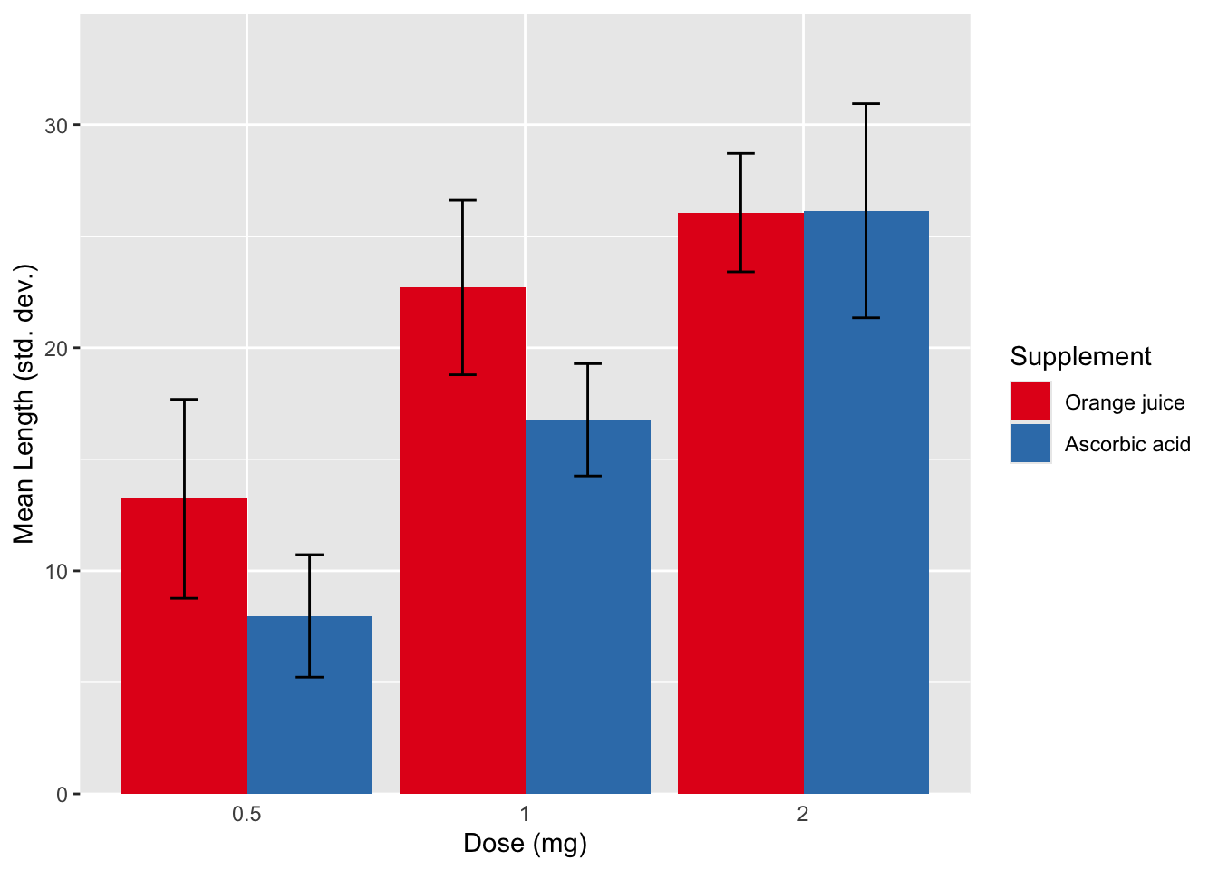
Similarity and Proximity are common place every multivariate plot. A very common construction is shown in Figure 53.2. Even without any background knowledge, we can immediately see that we have a continuous measure described by two color groups (red versus blue) and three x axis categories.
Exactly what the variables are requires further input, but we already know the experimental design without any introduction. This plot depicts the mean length of odontoblasts (the cells responsible for tooth growth) from 60 guinea pigs is described by two variables. Dose levels of vitamin C (3: 0.5, 1, and 2 mg/day) and delivery method (2: orange juice or ascorbic acid, a form of vitamin C).
Figure 53.2: Gestalt principles of similarity and proximity. One of the most frequent plot types in science is the dodged bar plot with error bars, which make use of the two most common gestalt principles.
In terms of structure, Figure 53.2 is great. Dose increases as we move along the x axis, the colors are easily distinguishable, and the error bars are clearly labeled. Unfortunately, this is where many biologists begin and end their data visualization journey. The problem here is two fold. This is not an exploratory plot since we are already viewing summarized data. Bar plots with error bars, although very common, are poor representations data. Second, as an explanatory plot, this plot should make use of the the next most common gestalt principle: connection. We can add a line to connect mean values across doses for each supplement. Although it is technically not paired or continuous data, since they are distance individuals, they are a progression in increasing dose. The use of lines for ordinal data is somewhat debatable. I make the distinction between ordinal and interval data. The distance between the categories holds information and it’s reasonable to connect the values with a line, which is what we’re asking the reader to do anyways.
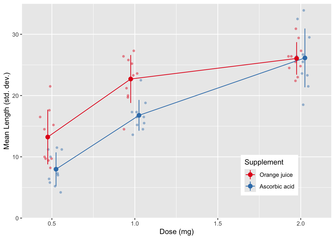
There’s one more thing. On the x axis, each dose is a doubling of the previous value, but the categories are evenly spaced. This is misleading, since the visual doesn’t match the empirical $mdash; spacing should reflect the actual values. Figure 53.3 contains a revised plot making these adjustments. Notice that the dots on each dose are dodged so that we avoid overlap between values as the same dose. Despite not sitting directly on the tick marks, there is no confusion about which dose each value represents. The error bars have also been simplified; point ranges don’t depict the meaningless crossbar at the tips of the error bar. In the background individual values are presented, and are not only dodged but also jittered. I’ll address jittering in section ?sec-ScatterPlots.
Figure 53.3: Gestalt principle of connection to show the trend in a data set.
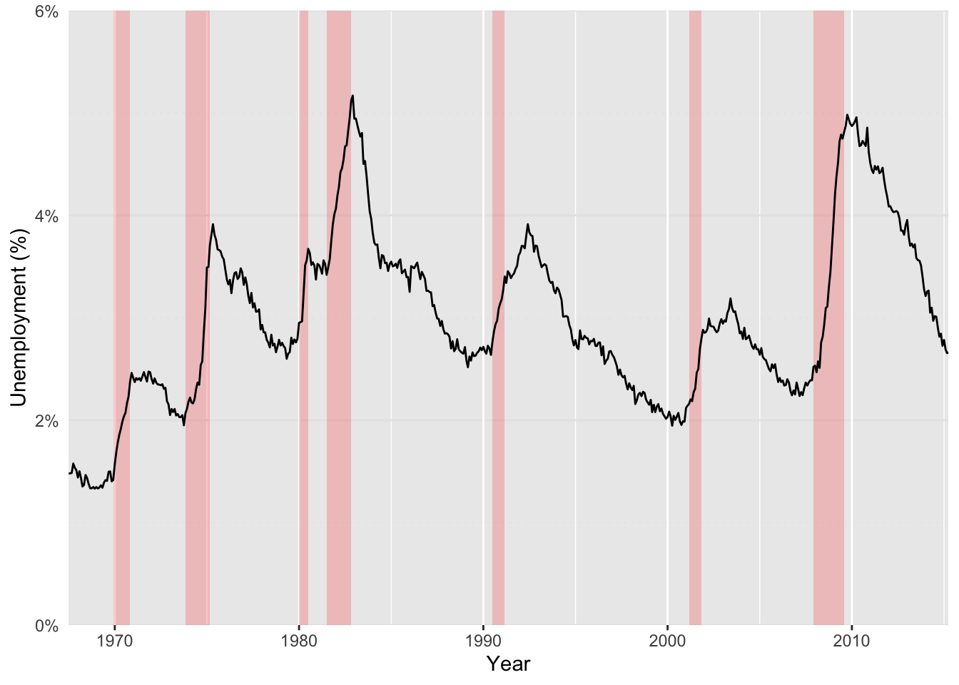
Enclosure is another common gestalt principle implemented in scientific plots. A common example of an enclosure is the use of background elements to highlight regions of a plot, as seen in Figure 53.4. Here we have the unemployment rate in the US from 1967 - 2014. Enclosure can take many forms, here, the shaded backgrounds highlight recession periods, which correspond to an increase in the unemployment rate.
Figure 53.4: A line plot with a shaded background is an exmaple of the gestalt principles of connection and enclosure
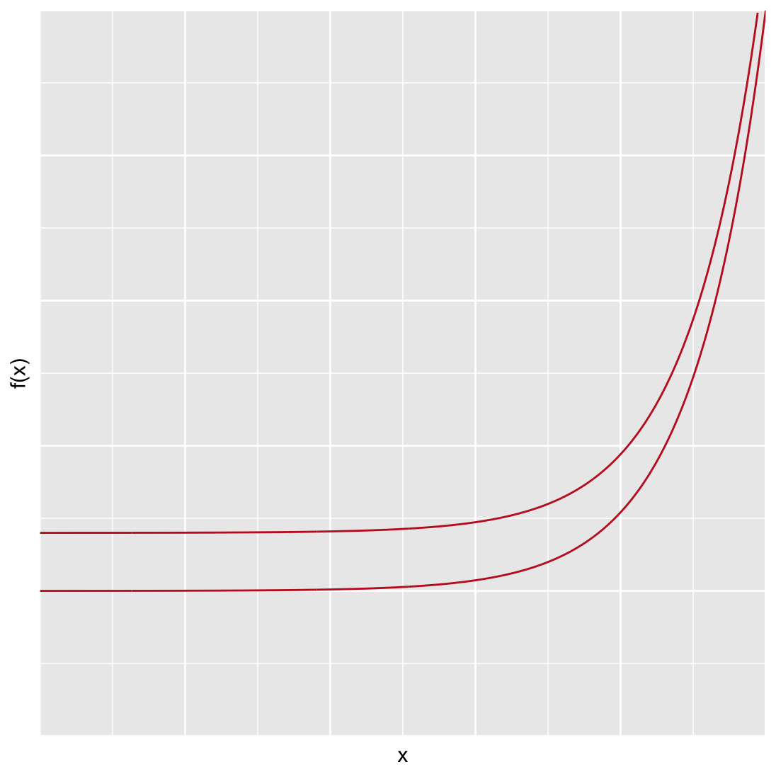
As an example of continuity, consider the plot of two curves shown in Figure 53.5. Many viewers expect that the two lines will converge somewhere outside of the plotting space. Our mind fills in the blanks given the trend we see, we expect that the lines will continue as we see them on the page. In reality, the only difference between the lines is their y-intercept — the distance between the two lines is constant along the x-axis! Our mind tricks us into seeing a trend that is not there. William Cleveland summarizes this phenomenon nicely: “… the minimum distances lie along perpendiculars to the tangents of the curves. As the slope increases, the distance along the perpendicular decreases, so the curves look closer as the slope increases … we cannot force our visual system to process the right segments without using slow sequential search.”
Figure 53.5: An example of the gestalt principle of connection and continuity.
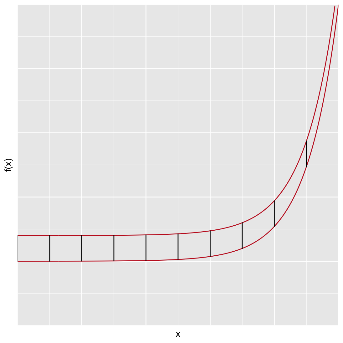
In this case if we wanted to overcome the fast form of visual perception, we have to invest a lot of work, adding embellishments or redrawing the plot. For example in Figure 53.6 the two lines are separated to make it difficult to draw false conclusions.
Figure 53.6: Separate plots make it more difficult to make incorrect comparisons.
Figure 53.7 line segments are added between each line to highlight that they are equidistant apart over the entire x range.
Figure 53.7: An example of the gestalt principle of connection and continuity.
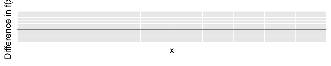
There is an underlying issue with all these solutions. Do we really need to show two lines when what we really want the viewer to know is that they are the same distance apart? If the difference between two lines is the message, then we should just show that! Figure 53.8 depicts this. It’s a pretty boring plot, but also the most honest and meaningful of the series.
Figure 53.8: Alternatively, plotting the actual difference between the lines reduces any confusion and makes the message even easier to convey.
Remember, fast forms of visual perception are typically used in explanatory plots, but we are constantly implementing gestalt principles, even when producing exploratory plots.
Barnett, Adrian, and Nicole White. 2024. “Something is off-base with this title: P esteems, statical significance and more slapdash stats.”Significance 21 (1): 11–13. https://doi.org/10.1093/jrssig/qmae007.
Bjork, Robert A, and Elizabeth L Bjork. 2011. “Making Things Hard on Yourself, but in a Good Way: Creating Desirable Difficulties to Enhance Learning.” In Psychology and the Real World: Essays Illustrating Fundamental Contributions to Society, edited by Morton A Gernsbacher, Robert W Pew, Leah M Hough, and James R Pomerantz, 56–64. Worth Publishers.
Briscoe, M. H. 2012. Preparing Scientific Illustrations: A Guide to Better Posters, Presentations, and Publications. Springer New York. https://books.google.de/books?id=mYTlBwAAQBAJ.
Cepeda, Nicholas J, Harold Pashler, Edward Vul, John T Wixted, and Doug Rohrer. 2006. “Distributed Practice in Verbal Recall Tasks: A Review and Quantitative Synthesis.”Psychological Bulletin 132 (3): 354–80.
Chasson, Gregory, and Sara R. Jarosiewicz. 2014. “Social Competence Impairments in Autism Spectrum Disorders.” In Comprehensive Guide to Autism, edited by Vinood B. Patel, Victor R. Preedy, and Colin R. Martin, 1099–1118. New York, NY: Springer New York. https://doi.org/10.1007/978-1-4614-4788-7_60.
Cheeseman, Ian H., Natalia Gomez-Escobar, Celine K. Carret, Alasdair Ivens, Lindsay B. Stewart, Kevin KA Tetteh, and David J. Conway. 2009. “Gene Copy Number Variation Throughout the Plasmodium Falciparum Genome.”BMC Genomics 10 (1): 353. https://doi.org/10.1186/1471-2164-10-353.
Daston, L., and P. Galison. 2007. Objectivity. Book Collections on Project MUSE. Zone Books.
Diemand-Yauman, Connor, Daniel M Oppenheimer, and Erikka B Vaughan. 2011. “Fortune Favors the Bold (and the Italicized): Effects of Disfluency on Educational Outcomes.”Cognition.
Hench, Virginia K., and Lishan Su. 2011. “Regulation of IL-2 Gene Expression by Siva and FOXP3 in Human t Cells.”BMC Immunology 12 (1): 54. https://doi.org/10.1186/1471-2172-12-54.
Hill, Jennifer, and Maria Singer. 2014. “A Comparison of Print and Digital Reading Comprehension by Middle School Students.”Reading Research Quarterly 49 (2): 185–203. https://doi.org/10.1002/rrq.68.
Lupton, E. 2010. Thinking with Type, 2nd Revised and Expanded Edition: A Critical Guide for Designers, Writers, Editors, & Students. Princeton Architectural Press. https://books.google.de/books?id=Y_NVRQAACAAJ.
Mangen, Anne, and Don Kuiken. 2014. “Lost in an iPad: Narrative Engagement on Paper and Tablet.”Scientific Study of Literature 4 (2): 150–77. https://doi.org/10.1075/ssol.4.2.01man.
Mangen, Anne, Bente R Walgermo, and Kolbjørn Brønnick. 2013. “Reading Linear Texts on Paper Versus Computer Screen: Effects on Reading Comprehension.”International Journal of Educational Research 58: 61–68. https://doi.org/10.1016/j.ijer.2012.12.002.
Margolin, Sara J, Christine Driscoll, Michael J Toland, and Jessica L Kegler. 2013. “E-Readers, Computer Screens, or Paper: Does Reading Comprehension Change Across Media Platforms?”Applied Cognitive Psychology 27 (4): 512–19. https://doi.org/10.1002/acp.2930.
Murayama, Hiroshi, Yusuke Takagi, Hirokazu Tsuda, and Yuri Kato. 2023. “Applying Nudge to Public Health Policy: Practical Examples and Tips for Designing Nudge Interventions.”International Journal of Environmental Research and Public Health. MDPI. https://doi.org/10.3390/ijerph20053962.
producer, Stephen Lambert ;. written executive, and produced by Adam Curtis ;. RDF Television; BBC. [2009?]. “The Century of the Self.” Standard format. Wyandotte, MI : BigD Productions, [2009?]. https://search.library.wisc.edu/catalog/9910135083802121.
Roediger, Henry L, and Jeffrey D Karpicke. 2006. “Test-Enhanced Learning: Taking Memory Tests Improves Long-Term Retention.”Psychological Science 17 (3): 249–55.
Rohrer, Doug, and Kelli Taylor. 2007. “The Shuffling of Mathematics Problems Improves Learning.”Instructional Science 35 (6): 481–98.
Roßa, N. 2017. Sketchnotes: Visuelle Notizen für Alles. frechverlag.
———. 2020. Sketchnotes: Die Große Symbol-Bibliothek. frechverlag.
Rousselet, Guillaume A, John J Foxe, and J Paul Bolam. 2016. “A Few Simple Steps to Improve the Description of Group Results in Neuroscience.”Eur. J. Neurosci. 44 (9): 2647–51.
Sanges, Remo, Yavor Hadzhiev, Marion Gueroult-Bellone, Agnes Roure, Marco Ferg, Nicola Meola, Gabriele Amore, et al. 2013. “Highly conserved elements discovered in vertebrates are present in non-syntenic loci of tunicates, act as enhancers and can be transcribed during development.”Nucleic Acids Research 41 (6): 3600–3618. https://doi.org/10.1093/nar/gkt030.
Singer, Leona M, Patricia A Alexander, and Deborah D Reese. 2014. “Reading on Paper and Digitally: What the Past Decades of Empirical Research Reveal.”Review of Educational Research 84 (4): 509–45. https://doi.org/10.3102/0034654314541101.
Slamecka, Norman J, and Peter Graf. 1978. “The Generation Effect: Delineation of a Phenomenon.”Journal of Experimental Psychology: Human Learning and Memory 4 (6): 592–604.
“Status of Mind - social media and young people’s mental health and wellbeing.” 2017. Royal Society for Public Health.
Wästlund, Erik, Lars Nilsson, and Kenneth Holmqvist. 2012. “Eye Movement Patterns and Reading Processes in Eye-Friendly and Non-Eye-Friendly Typography.”Information Design Journal 19 (2): 119–32.